Material Intelligence
This season in Milan and Paris, the most powerful runways came alive through stunning materials, beautiful craft, and raw tactility — the hand of the atelier, the soul of the house.
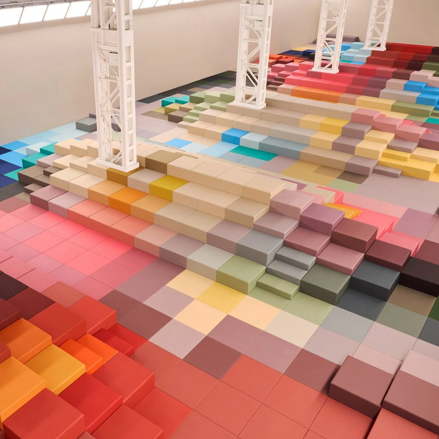
Fendi × Marc Newson (SS26)
What looked like pixels ripped from a render became something slower and stranger: a quilted landscape of bold colour blocks. Digital geometry reimagined as craft — a set that looked virtual but felt deeply present.
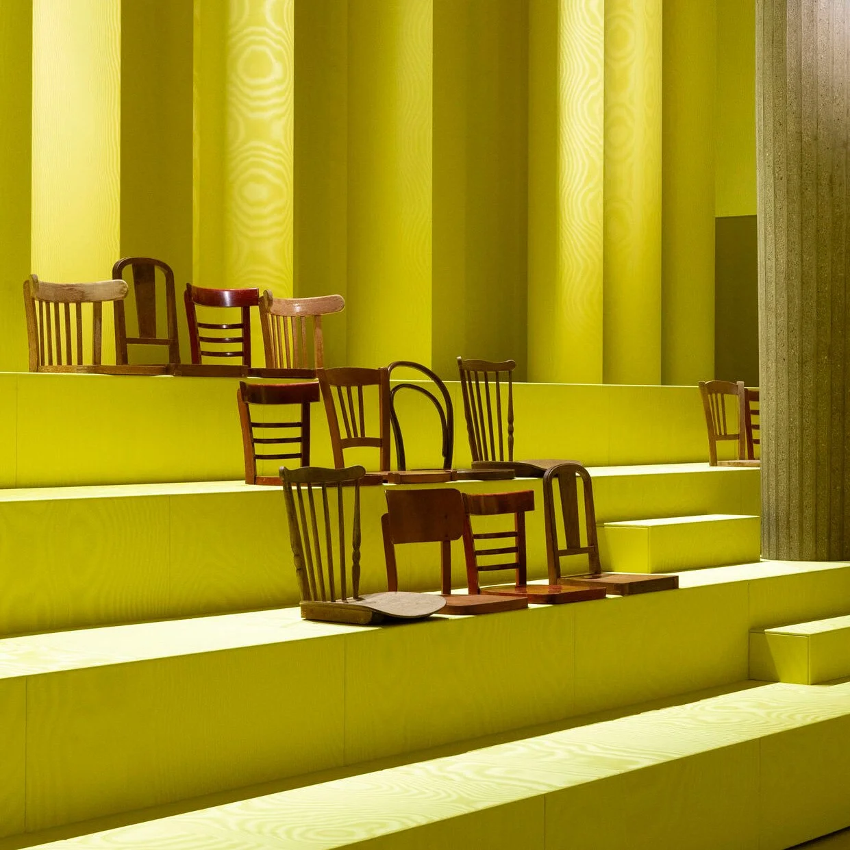
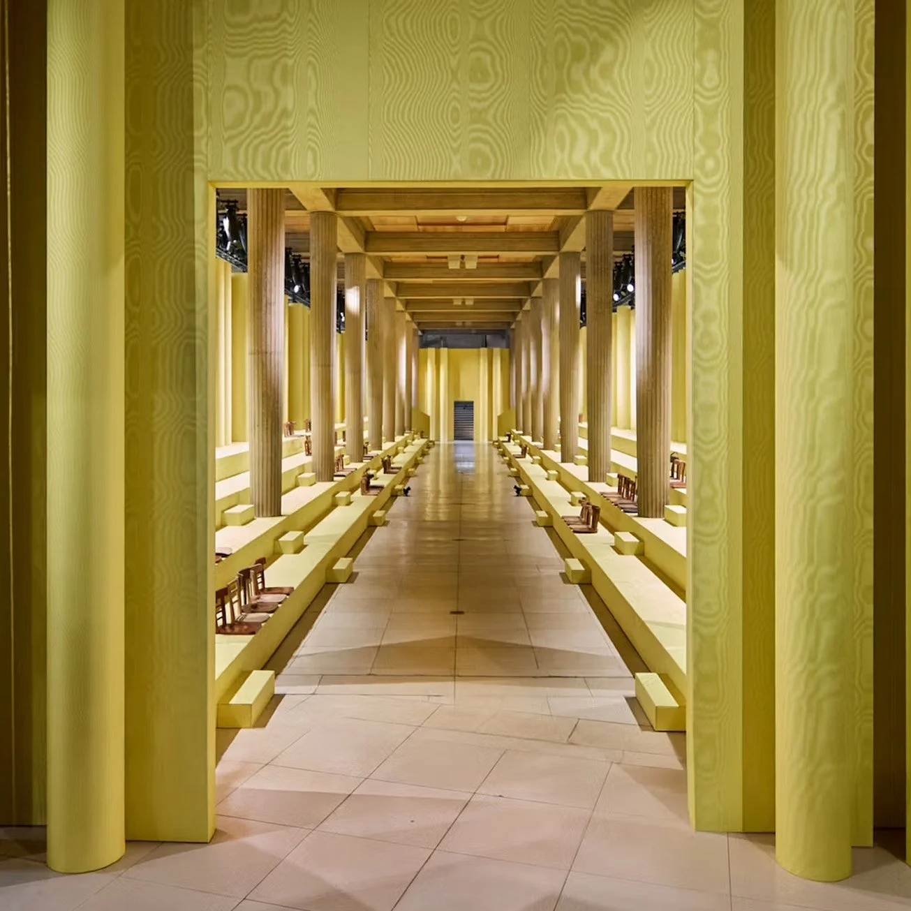
Miu Miu (AW25)
Miuccia Prada foreshadowed the shift with an uncanny dreamscape: a room wrapped in shimmering yellow moiré, lined with rows of sawn-off wooden chairs. Awkward, intimate, defiantly non-digital.
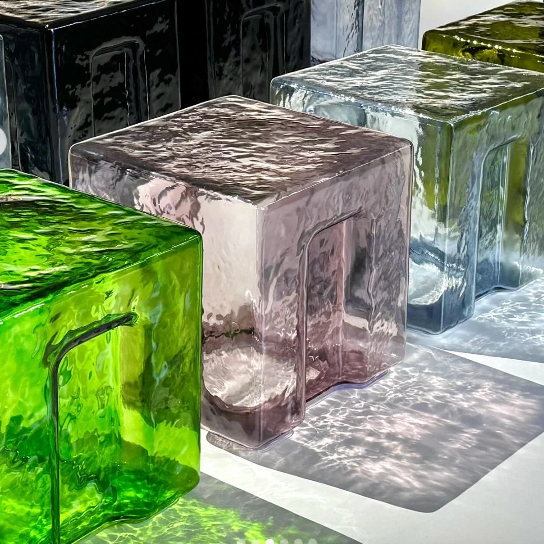
Bottega Veneta (SS26)
Guests perched on hand-blown Murano glass stools — each irregular, luminous, centuries in the making. Not just seats, but sculptures carrying Venice’s heritage into the fashion system. Fragility became part of the theatre.
These weren’t nostalgic gestures.
They weren’t retro throwbacks.
👉 They were radical stances.
Here’s the shift: Material Intelligence is emerging as a cultural and creative counterweight to Artificial Intelligence.
Where AI simulates, scales, and accelerates…
Material Intelligence grounds, slows, and gives presence.
Not opposites, but complements — equal forces designers must orchestrate.
The opportunity for brands? To design with both in concert.
✨ To create experiences where code feels textured, and craft feels amplified.


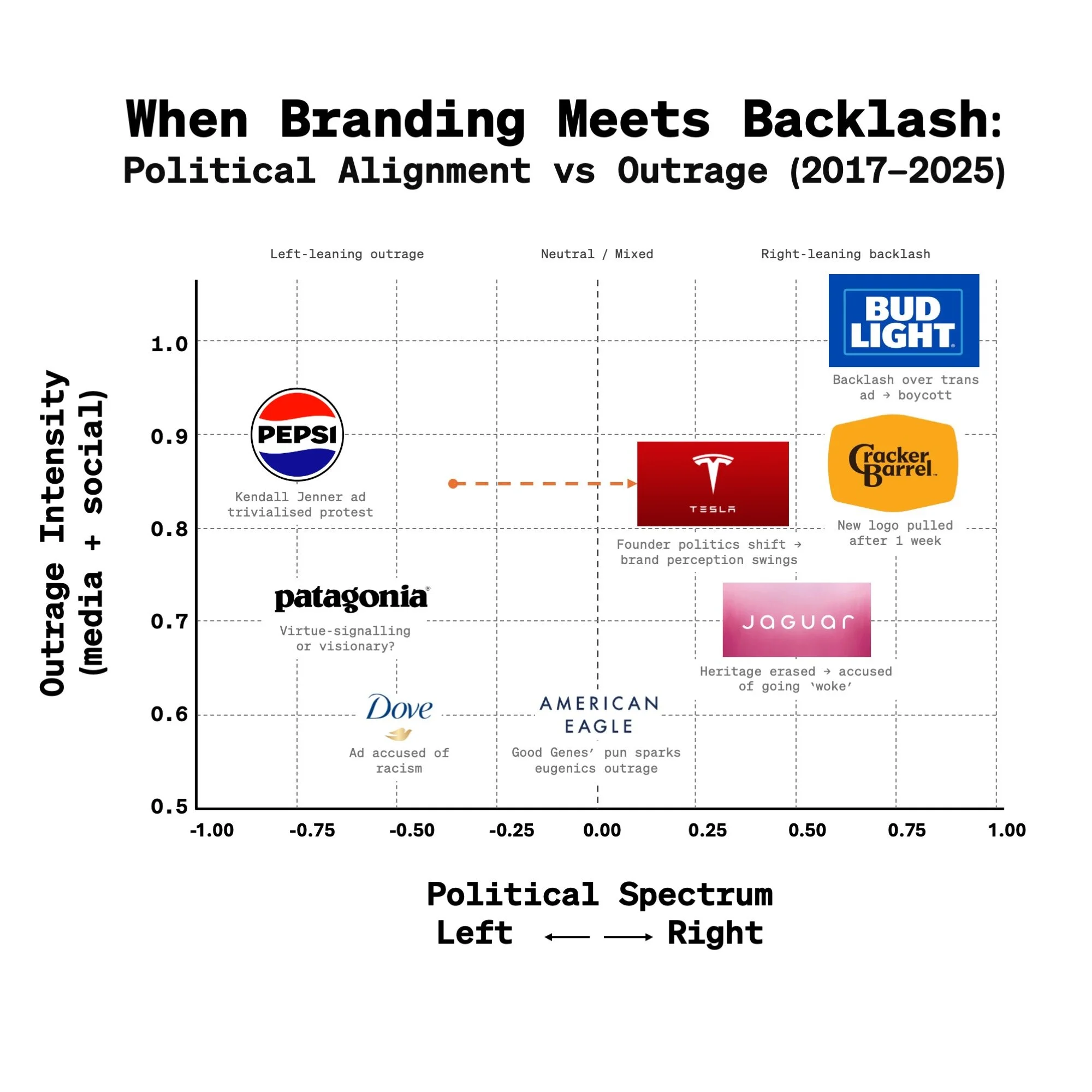
Outrage Wasn’t in the Brief:
Shielding Junior Creatives in a Culture War Era
Cracker Barrel just scrapped its new logo after a week of backlash, returning to its “Old Timer” identity. Before that, American Eagle’s “Good Genes/Jeans” campaign was slammed as tone-deaf. And Jaguar’s rebrand was attacked as “woke” for moving away from heritage cues.
Different industries, different intentions — same result: outrage.
In 2025, it feels almost inevitable that a brand identity, campaign, or repositioning will get caught in the crossfire of the culture wars. But here’s the part we don’t talk about enough:
👉 Behind every logo refresh and campaign line are young designers. They’ve poured months into pixels, palettes, and kerning — only to wake up and see their project trending as “woke,” “racist,” or “tone-deaf.” The internet isn’t critiquing their craft, it’s weaponising it. And yet their portfolios — and their careers — get tied to a culture war they never asked to fight.
So what now? Do we shrug and accept backlash as just another step in the design cycle? Or do leaders step up — shielding their teams, mentoring younger creatives, and reminding them that the outrage isn’t about their craft, but about how brands get dragged into today’s culture wars?
Maybe the real measure of a design culture today isn’t how it weathers public outrage — but how it takes care of the people behind the work when it does.
There’s nothing like launch day.
The adrenaline of the idea.
The pressure of the build.
The quiet thrill when it goes live - and the world finally sees it.
This short film is a love letter to that moment -
when a brand shows up for real,
a product ships,
and what was once an idea becomes presence you can feel.
In the past 18 months, I’ve had the chance to help shape and ship many, including:
📺 Netflix - turning an Upfront event into an emotional experience
🚙 Scout - reviving an American icon for a new generation
👟 New Balance - from a Boston launch party to global rollout
🚗 AFEELA - a new EV brand launched in California
From mobility to media, retail to reinvention -
every drop proved the same truth:
Presence isn’t just showing up.
It’s showing you mean it.
There’s Nothing Like Launch Day


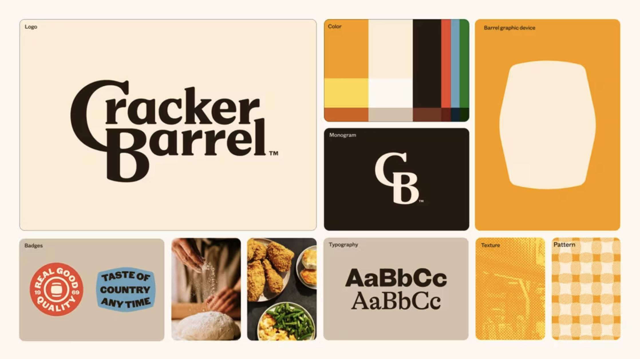
Signal vs. Product A Cracker Barrel lesson
This past week has seen a disproportionate amount of discussion around just the Cracker Barrel logo — and not the bigger transformation underway.
As a designer and Creative Director across visual identity, product, and interior design, I think we’re missing the bigger point: the logo and identity elements are the grammar inside the full brand story. They set the rules, tone, and structure. But the story itself is delivered through the complete brand experience — the food, the interiors, the service, the ambience.
That’s where the tension lies:
The logo is the signal of change.
The experience is the product of change.
Both matter. But they don’t have to evolve at the same pace.
👉 A visual identity can shift more gradually — even in a couple of steps — signaling freshness without alienating loyal customers. Meanwhile, the product experience (menus, interiors, service) can take bolder leaps, explore, and experiment.
Cracker Barrel may have signaled a revolution before customers were ready to experience one. Time will tell if that gap closes or widens.
Takeaway for marketers and designers:
When we design change, we’re not just designing logos, menus, or interiors. We’re designing both signals and products — and the calibration between them is everything.
👁️✨ The next leap in human interaction with brands won’t happen with our opposable thumbs - it will begin with our eyes wide open.
Our posture has always mirrored our technology.
📞 1G - Phones to ears. Listening, not looking.
📡 2G - Phones in pockets. Heads up. Presence intact.
📷 3G - Cameras arrived. Heads dipped. Arms angled.
📲 4G - The scroll era. Thumbs swiping. Eyes glued.
📡 5G - Always on. Arms outstretched. Streaming life instead of feeling it.
🔮 Next Gen?
It’s no longer about looking at devices - but looking through them.
As Google, Snap, Meta, and others push everyday Augmented Reality glasses into the mainstream, we’re shifting again - fast:
• Google Android XR (2025) - Powered by Gemini, in collaboration with Gentle Monster, Samsung, and Warby Parker.
• Snap Specs (2026) - Lightweight, social, designed for daily wear.
• Meta Orion (2027) - High-fidelity AR backed by Ray-Ban, Oakley, and EssilorLuxottica.
Heads up. Both hands free. Eyes unlocked.
👁️ Your gaze becomes the interface.
💃 Your body becomes the controller.
🌍 And the world becomes the canvas - responsive, intelligent, alive.
What does this mean for brand designers?
→ Brand identities that come to life in physical space
→ Packaging that tells its story in AR - origin, craft, sustainability
→ Retail spaces that react to a customer’s attention and mood
→ Wayfinding that guides without distraction
→ Events and activations you step into, not just look at
💡 We’re not just changing how we use tech.
✨ We’re turning movement into meaning - and sight into sensation. 👁️
I used the LEGO store in NYC we designed four years ago as the canvas here - but the same AR magic could apply to any brand space.
From Heads-Down To Heads-Up
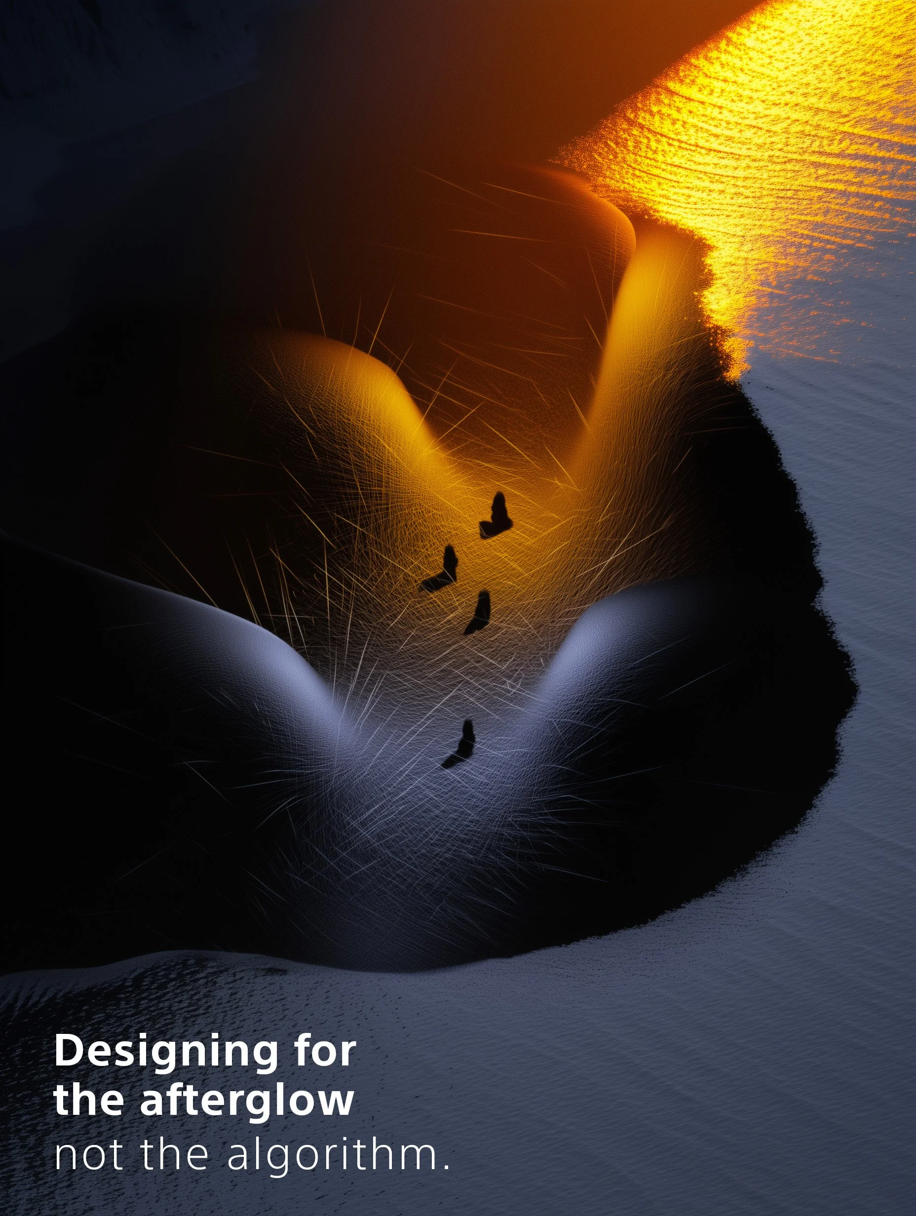
Designing for the afterglow, Not the algorithm ✨
So many of today’s brand experiences are over-optimized for the scroll:
Built to be captured, filtered, and shared.
We design for the story. The scroll bait. The algorithm.
But what if the real impact happens after the post?
When the lights go down.
When the music stops.
When people return to their lives - and still think about you.
That’s afterglow ✨.
And that’s where brand presence lives.
Presence isn’t just about showing up.
It’s about leaving something behind.
Not a hashtag - a feeling.
We’ve all been to branded spaces and activations that looked stunning on social… but faded instantly.
And we’ve all had moments so emotionally resonant, so human, they stuck with us - even without a single photo.
Designing for presence is about making people feel something that lingers.
Not louder. Deeper.
Less “look at this.”
More “remember how that felt.”
Because algorithms change.
But feeling is forever.
The deeper the feeling, the longer the memory - and the stronger the brand.
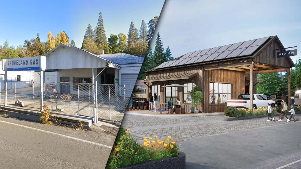
TESLA vs RIVIAN
Two Charging Stations. Two Worlds. One Truth.
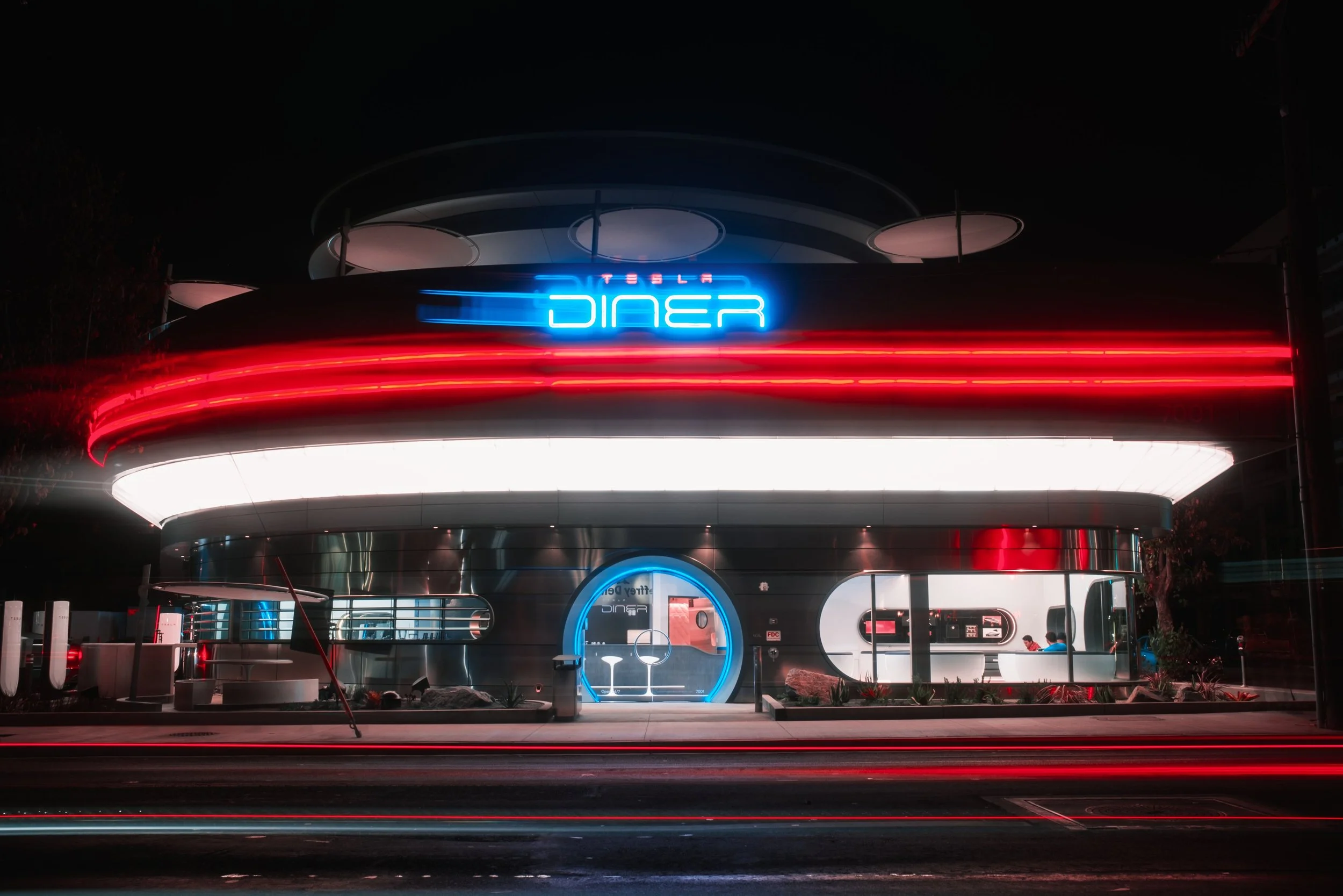
This is a study in brand design.
Not logos. Not taglines.
But design that’s spatial, emotional, and quietly strategic - the kind that leaves a memory behind.
Because EV charging is no longer just utility.
It’s becoming brand theatre.
A new ritual around recharging.
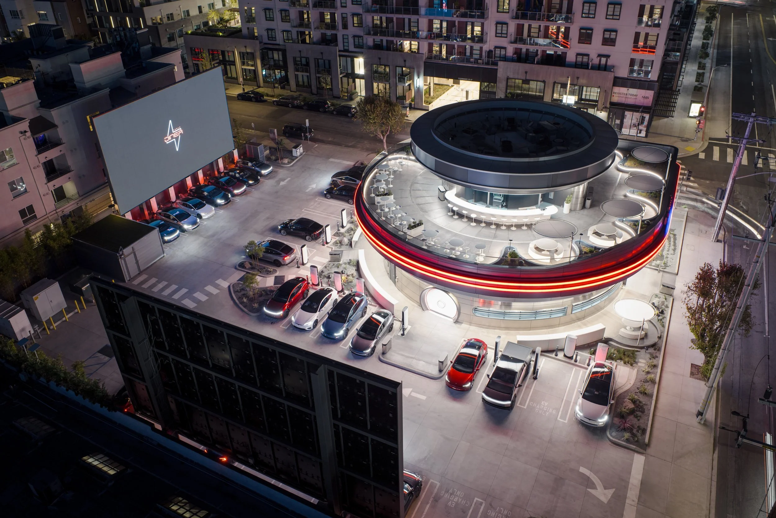
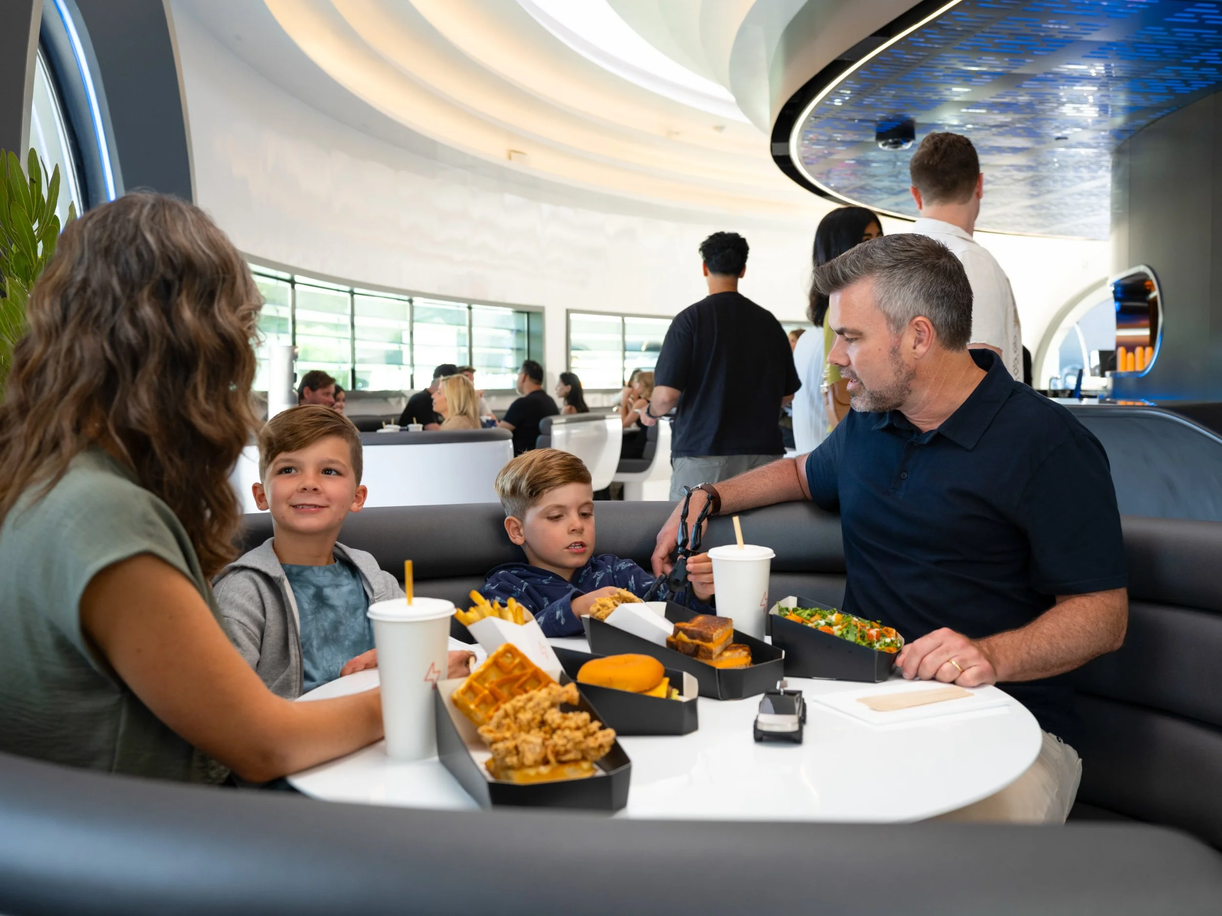
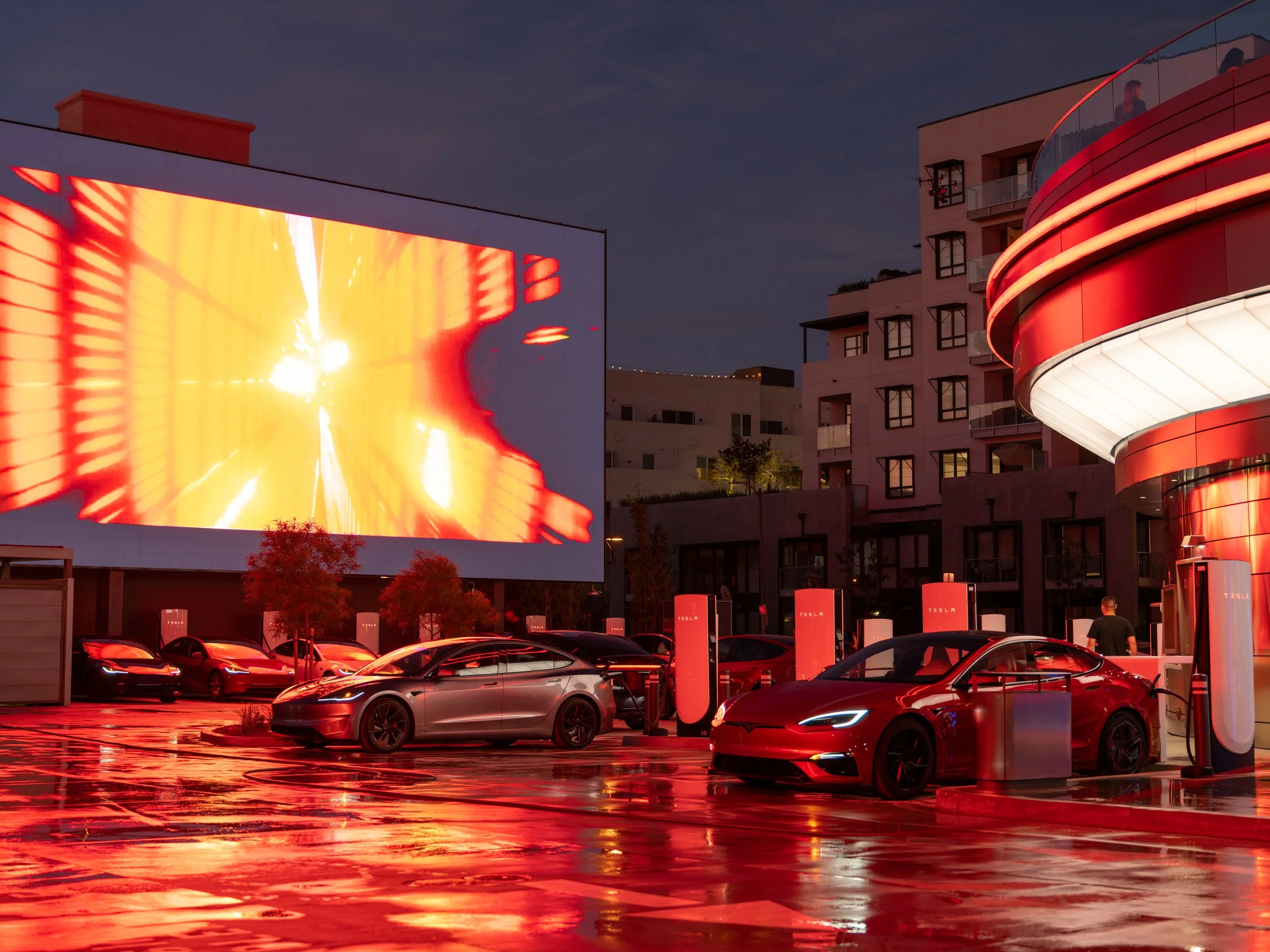
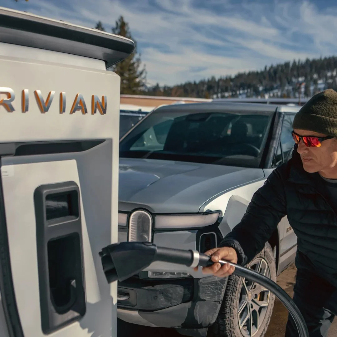
This week, Tesla opened the doors to its most cinematic concept yet:
a retro-futuristic Supercharger, diner, and drive-in experience
on historic Route 66 in West Hollywood, Los Angeles. CA.
⚡ 80 V4 Superchargers (open to all NACS-compatible EVs)
🍔 250+ diner seats, open 24/7
🎥 Two 66-foot LED movie megascreens
🛼 Roller-skating servers
🤖 Tesla Optimus robot displays
🧢 Exclusive merch ('Cyberberry gummies' + diner tees)
All ordered via touchscreen - in your EV.
All delivered to your driver’s window - by design.
The Tesla Diner isn’t just a pit stop.
It’s a sci-fi stage set for the EV future.
Where nostalgia and next-gen tech share fries under solar canopies.
Where charging becomes cinema.
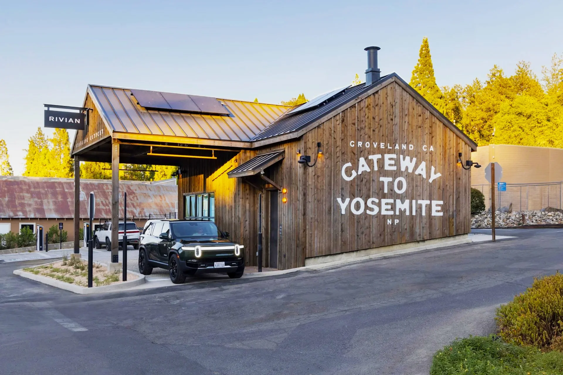
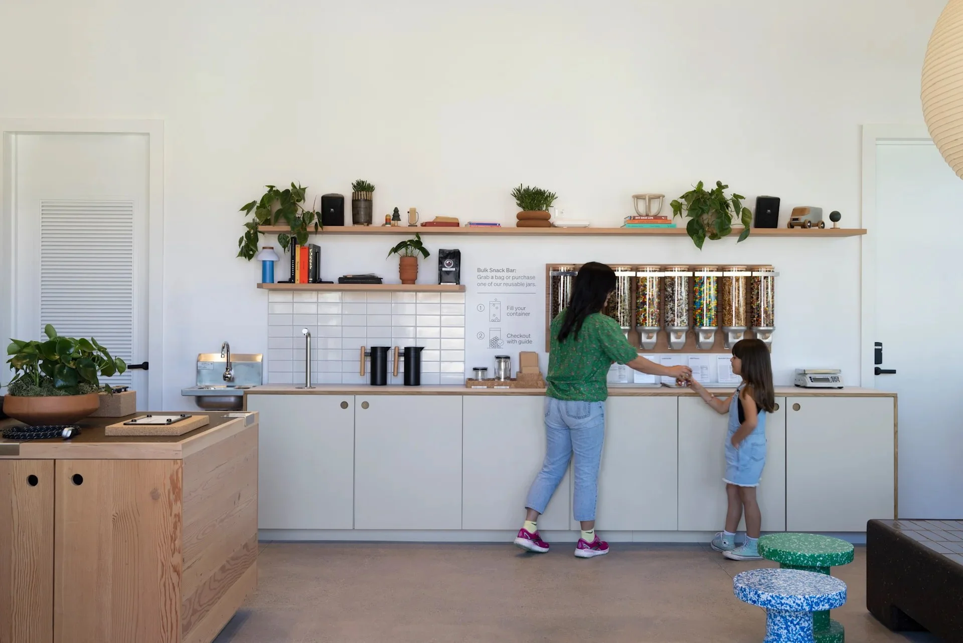
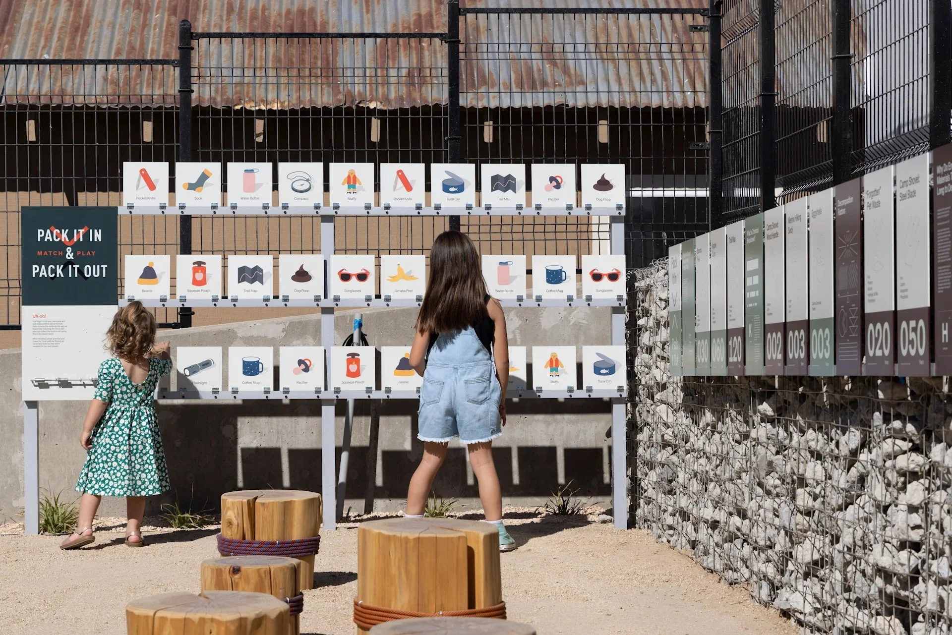
Meanwhile, 350 miles north in Groveland - just outside Yosemite National Park Rivian took a much quieter approach.
The Rivian Yosemite Charging Outpost, opened one year ago,
transformed a defunct gas station into a peaceful waypoint.
🔋 Five fast chargers, quietly integrated
☕ Complimentary local coffee
🌱 Native plants + pollinator gardens
📚 Local library-style shelves
🌬️ Passive cooling via smart ventilation
👨👩👧👦 Educational displays for families
Where Tesla delivers spectacle, Rivian offers sanctuary.
One says, “Post this.”
The other says “Feel this.”
Forget the politics around Elon for a moment.
This is a masterclass in brand presence.
Both brands are proving that charging stations can be brand strategies.
They’re turning dwell time into meaningful brand time.
They’re designing emotion into infrastructure.
They’re making space matter - again.
Because the real innovation isn’t the EV.
It’s how brands design the lived experience of ownership -
the recharges, the rituals, the road in between.
And increasingly, that matters more than the moment of purchase.
(The car lot is dead. The journey is alive.)
When these in-between moments are designed with intention,
brands don’t just earn loyalty.
They create belonging.

Since Midjourney launched in 2022, I've been running a simple yet powerful pangram prompt regularly: "The quick brown fox jumps over the lazy dog." 🦊 🐶
This sentence, utilizing every letter of the alphabet, serves as a fascinating gauge of generative AI's growth in listening, imagining, and visualizing stories over time.
Here's a glimpse of how this prompt evolved annually:
2022 - Glitched Sketch
2023 - Storybook Dream
2024 - Cinematic Vivid
2025 - Emotive & Living Motion
Witness the transformation: from a static pose to dynamic actions like running, breathing, and jumping in the latest clip produced by Midjourney's cutting-edge AI video model, V1. It's remarkable to see the evolution of the same sentence across three years.
As we look ahead, envision the possibilities for next year - could we immerse ourselves in experiences enhanced with sound, aroma, and touch?
One Fox. One Prompt.
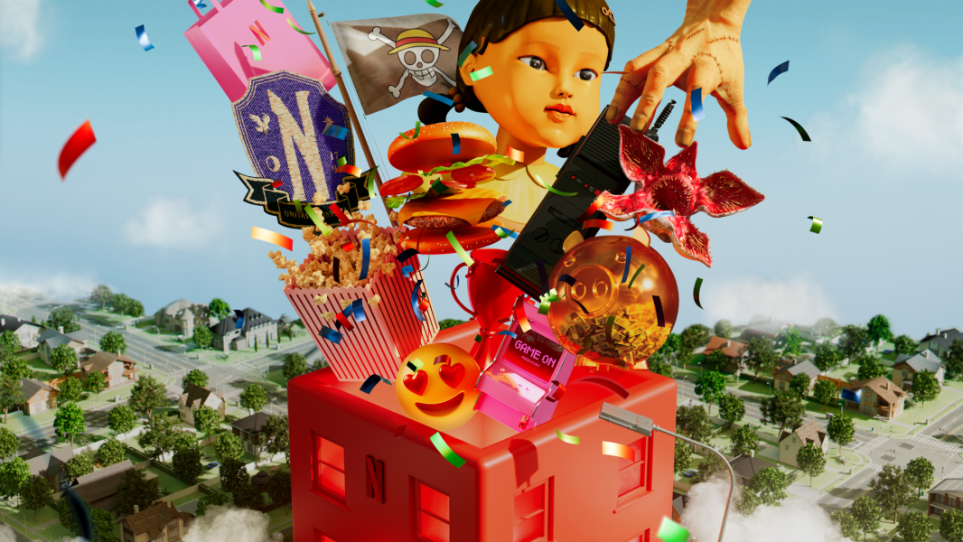
Netflix House: Your Next Story Awaits
Thrilled to see Netflix House officially unveiled!
I had the privilege of being part of the team that crafted the original strategy and concept vision for this idea back in 2023, working closely with the internal Netflix team to imagine what a permanent Netflix experience could be.
It’s incredible to see the final visuals - and I can’t wait for fans to step inside and become the Main Character!

Los Angeles Pink
Could the vivid, almost electric pink of aerial fire-retardant drops - stripped of its harsh chemicals - become the unofficial color of Los Angeles’ recovery from the devastating January fires? 🔥 Imagine Pantone 806 C, that unapologetically bold hue, reimagined not as a warning of destruction, but as a banner of resilience.
It’s the same pink that stains the hillsides after the flames, impossible to ignore, lingering in the mind long after the smoke clears. What if that color became a rallying symbol? A way to carry the city’s spirit forward — fierce, bright, and unafraid to be seen.
Picture it emblazoned across T-shirts, hoodies, hats, and water bottles — worn by Angelenos and supporters everywhere. Each item raising funds for recovery efforts, each splash of pink radiating hope. 💖 A color that tells the story of a city that doesn’t just survive the fire, but rises from it stronger, bolder, and more united than before.
-
![]()
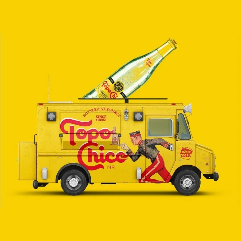
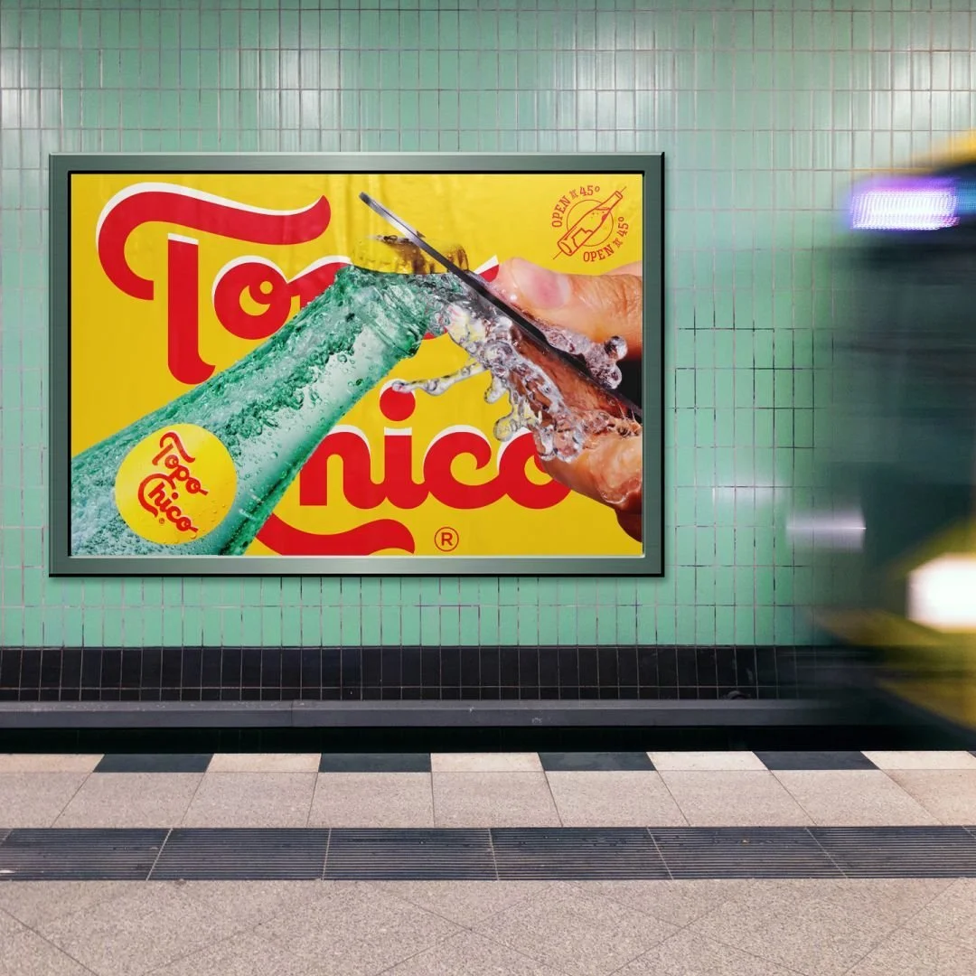
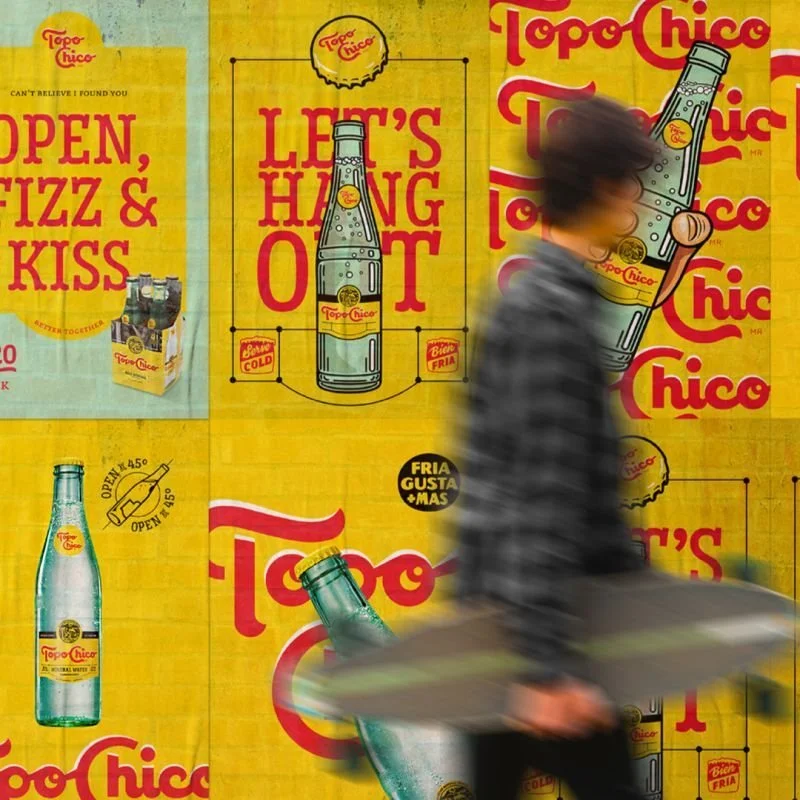
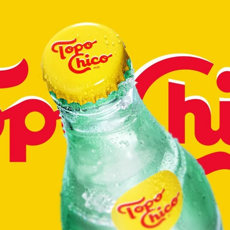
Topo Chico
-
![]()
125 years
-
![]()
A source of discovery
-
![]()
Retaining its roots
-
![]()
Refreshed and versatile identity
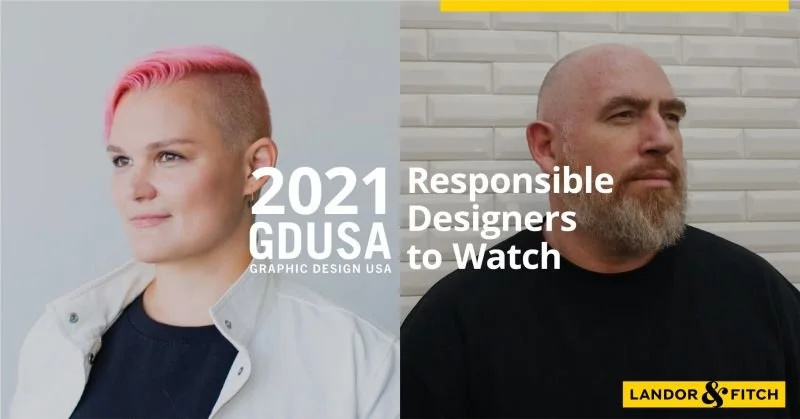
Responsible Designers to Watch
“Good design is a useful to society as good money.” said the late Rodney Fitch. Today I am fortunate to be working at Landor & Fitch which still strives to make a positive difference for our clients, our communities, and the world with extraordinary brand transformation by design.
I am honored to be named as one of the GDUSA Magazine USA’s 'Responsible Designers to Watch' 2021 alongside my colleague and friend MB.
Answer the Call
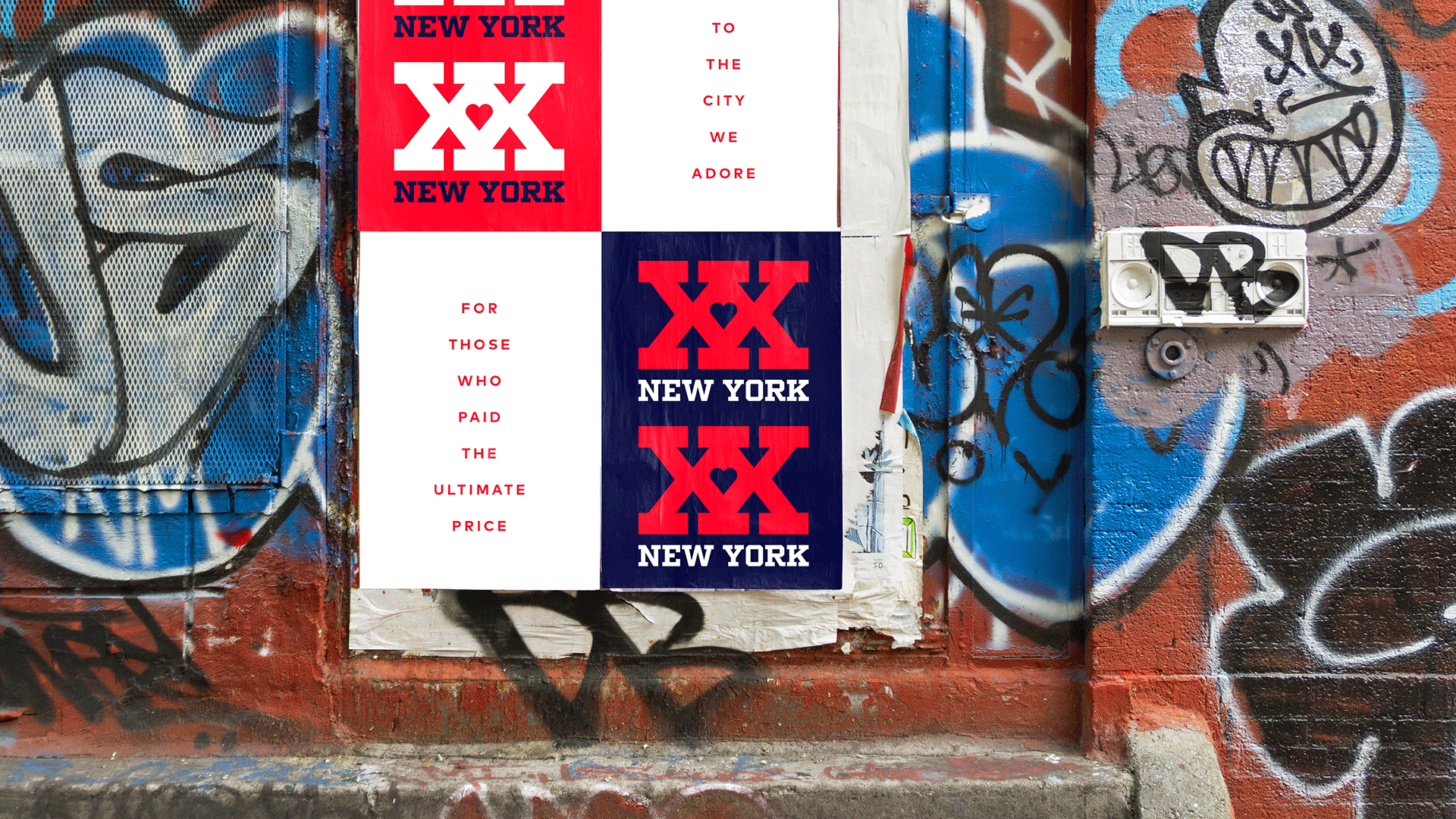
In honor of the 20th anniversary of 9/11, our Landor & Fitch New York studio designed the XX New York campaign and merchandise to support the New York Police and Fire Widows and Children’s Benefit Fund - also known as Answer the Call.