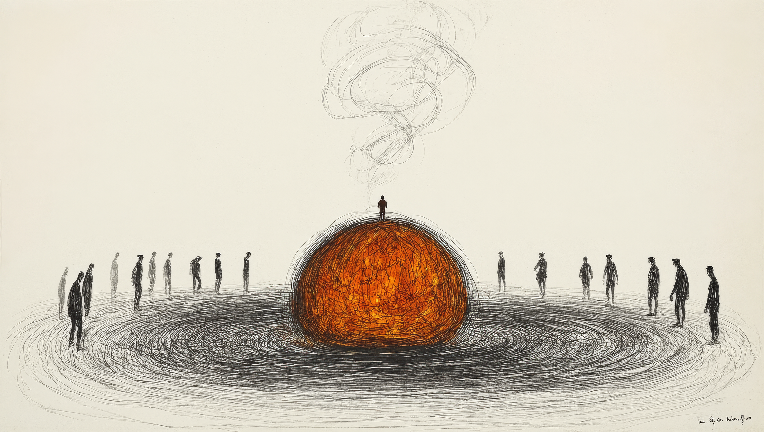
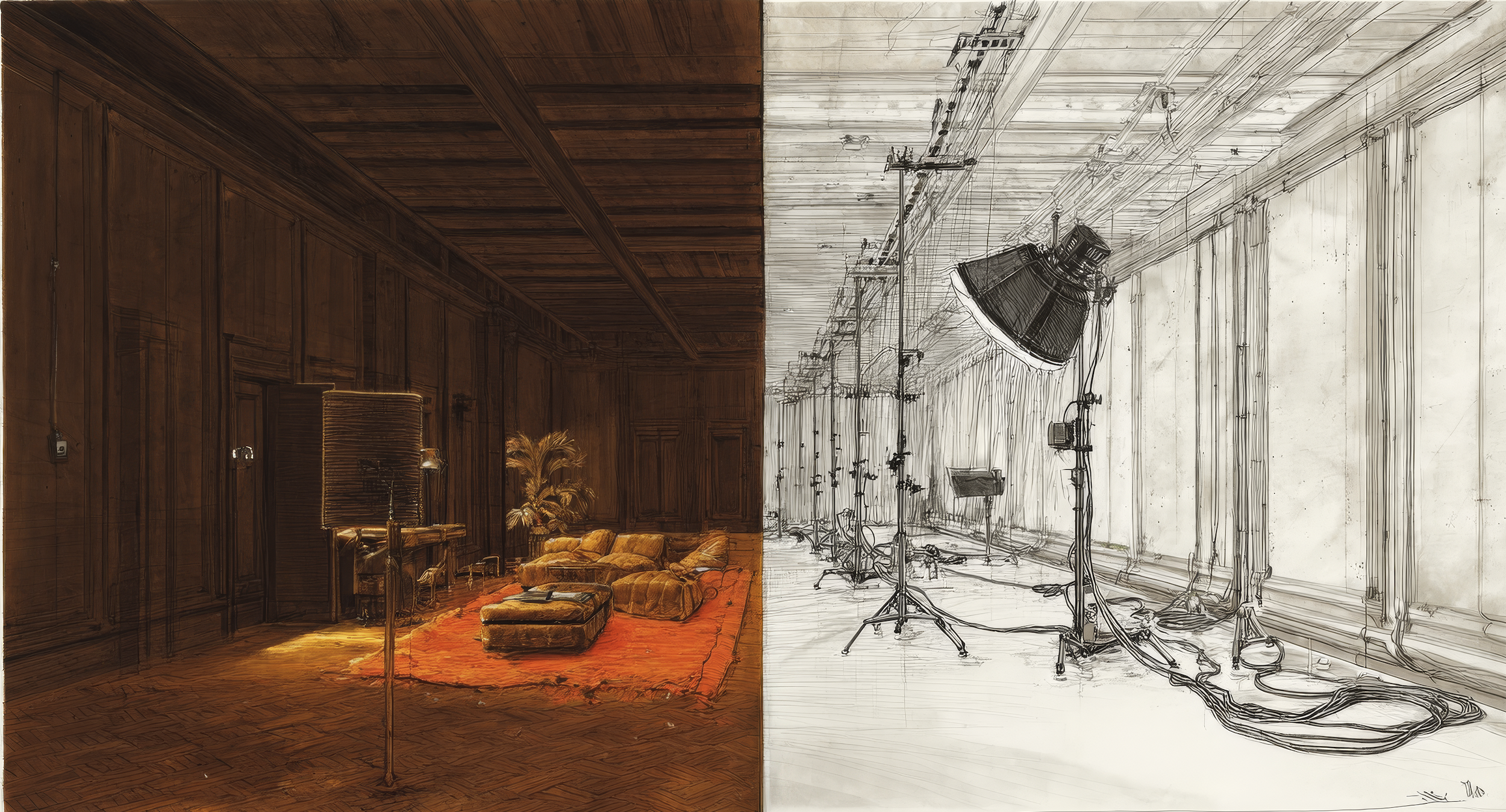
The Collision Engine is how I think. It's the process of approaching a problem from every angle except the obvious one — reversing it, turning it inside out, coming at it from a tangent — until ideas collide and something sparks that nobody standing at the front door could have found. It's also what I've discovered about the best creative work: it happens at the intersection of things that weren't supposed to meet. Brand and space. Strategy and spectacle. Human presence and artificial intelligence. London craft and California innovation. This is where I write about those collisions — and what they produce.
The Collision Engine
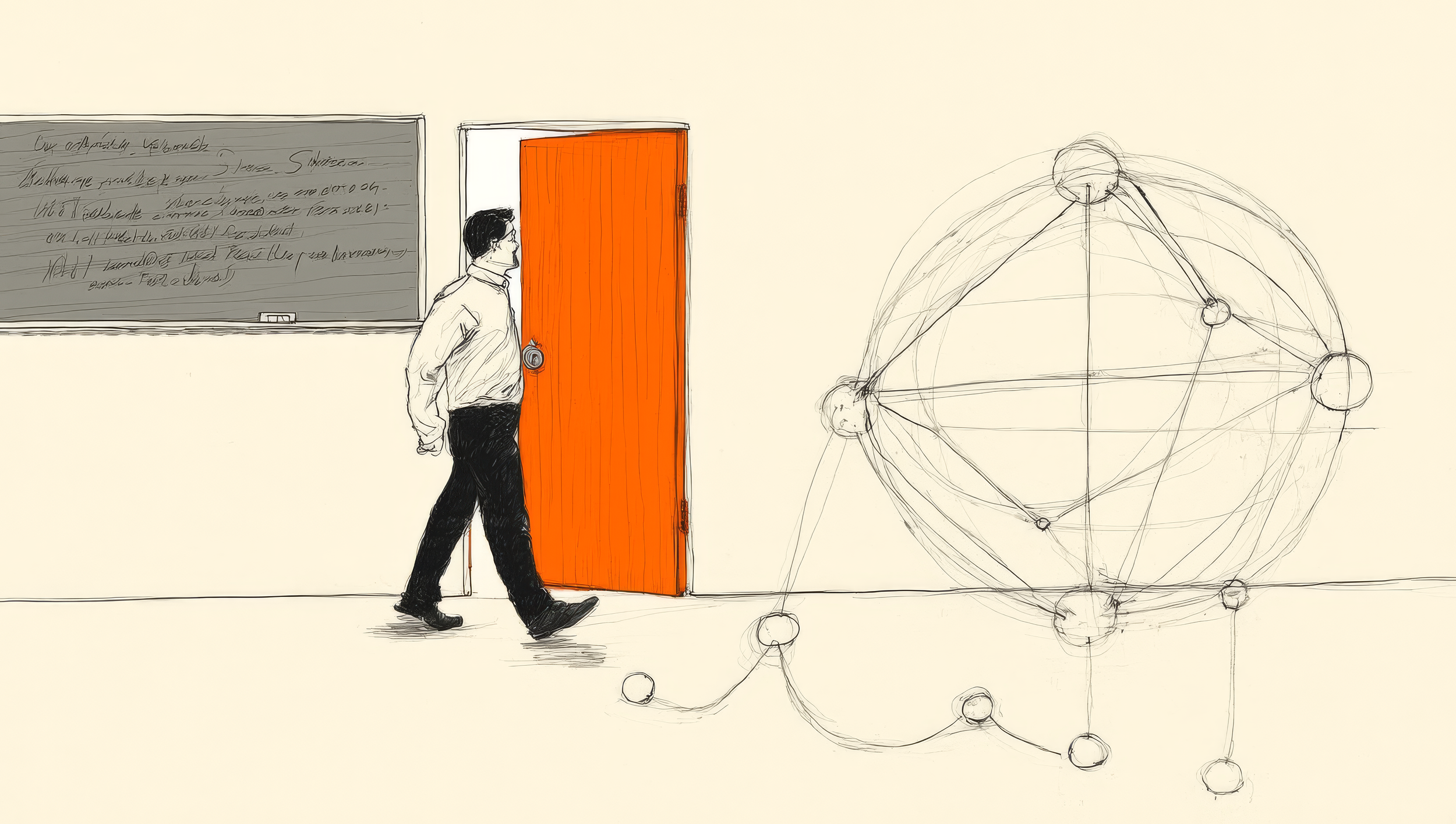
They Don’t Invoice

Smaller teams. Faster deadlines. Clients briefing with generic AI images. Every brand in every category dancing on the same pinhead.
The antidote isn’t a new process. It’s a new perspective. Ten of them actually — from ten creative professionals who think nothing like you.
A Journalist. A Filmmaker. A Tailor. A Game Developer. A Conductor. A Sculptor. A Couturier. A DJ. A Broadcaster. An Editor.
None of them think like a designer. None of them were trained like a designer. None of them look at a brief and see what you see.
That’s exactly why they’re useful.
How to use them
Ten lenses. Each one a different creative professional looking at your brief and seeing something you don’t.
Use one at the start to reframe the ambition before a single pixel gets placed. Use three in a brainstorm to crack something that isn’t working. Use all ten as a pre-presentation checklist to make sure you’ve pushed far enough.
The lenses are most powerful at mid-fidelity. Before ideas harden into decisions that cost too much to undo.
Pick one up. Look through it. See what changes.
01 — Dig Like a Journalist
Discover the story nobody has told yet.
Before you place a single pixel or put pen to paper — discover the story nobody has told yet.
Ask what would make this experience genuinely newsworthy. What would get it into the Guinness Book of World Records? The longest. The tallest. The first. The only.
That question kills incremental thinking instantly. It doesn’t change the brief. It changes the ambition.
Find the angle. Find the story. Find the one line that makes someone tell another person what they just experienced.
That’s your brief now.
02 — Fit Like a Tailor
Cut for one. Make every visitor feel like the only guest.
A bespoke suit and an off-the-rack suit can be made from the same cloth. The difference is invisible until you put it on. Then you feel it immediately.
Most brand experiences are off-the-rack. Built from a template. Adapted from last year’s project.
Cut for one. Know who is walking through the door — not the demographic, the actual human. Their pace, their expectation, their emotional state on arrival. Then go further — personalise within the experience itself. A moment where the visitor feels the experience knows them.
Make every visitor feel like the only guest.
03 — Direct Like a Filmmaker
Shape the narrative arc from opening titles to last frame.
Every great film has a shape. A beginning that pulls you in. A middle that builds tension. An end that lands.
Most brand experiences are flat. A sequence of moments with equal weight, equal pace, equal importance. Nothing builds. Nothing releases.
Shape the narrative arc from opening titles to last frame. Find the single highest emotional moment and build the journey toward it. Design the ending — because that’s disproportionately what people carry with them.
Identify the hero image before you build anything. The shot that fills a Cannes Lions board. The photograph that makes someone who wasn’t there wish they had been. If you can’t identify that image before the experience is built, you haven’t finished conceiving it yet.
04 — Layer Like a Game Developer
Code for participation, not spectating.
A game is never just what you see on the surface. Underneath is an architecture of hidden systems. Rewards spaced at precisely the right intervals. Challenges to overcome. Levels that only reveal themselves to those who go deeper.
Most brand experiences are designed to be looked at. The Game Developer flips that completely.
Code for participation, not spectating. Gamify the moment — create challenges, obstacles, and discoveries that reward the curious. Design for the feeling of finding something, not just seeing something.
And ask the question most brand experiences never ask: why would someone come back — and pick up where they left off?
05 — Orchestrate Like a Conductor
All five senses working in concert together.
A conductor stands in front of a hundred musicians playing completely different instruments. Their job is not to play any of them. Their job is to hold all of them together and make something that sounds like one thing.
Most brand experiences don’t have a conductor. They have a committee.
All five senses working in concert together. Light, sound, scent, material, temperature, human interaction — every element is an instrument. Give each one its moment then let it recede. Make the whole feel like one inevitable thing.
Design for the live condition not the render. A conductor reads the room and adjusts in real time. So should the experience.
06 — Shape Like a Sculptor
Command physical authority and formal presence.
Most work distributes visual weight evenly. Everything gets its moment. Everything is safe.
Three moves. Super-scale — find the single most important element and make it enormous. Not big — enormous. Big enough that it stops being a graphic and starts being an event. Multiples — take one element and repeat it obsessively until the repetition itself becomes the experience. Deconstruct — break it apart entirely and make the audience mentally reconstruct it.
Command physical authority and formal presence. None of these require changing the brief. All of them transform how the work feels.
07 — Style Like a Couturier
Craft for timelessness, not the trend cycle.
LV. Balenciaga. Maison Margiela. A Couturier doesn’t follow the trend cycle — they create it or ignore it entirely. Every choice intentional. Nothing accidental. Nothing settled for.
Ask the most brutal question in the toolkit: could this experience hold its own in the courtyard at Salone del Mobile — Milan Design Week? Could it sit alongside the installations at Art Basel in Miami without looking corporate, embarrassed, or afraid?
Strip the branding entirely. Does it still have authority? Does it still have a point of view? Is every material, finish, and typographic choice intentional — or did it happen by default?
Craft for timelessness, not the trend cycle.
08 — Energize Like a DJ
Builds, breakdowns and drops. Program like a DJ set.
A DJ never plays the set they planned. They plan it. They know every track. Then they walk into the club, read the energy, and adjust.
The build. The breakdown — stripping everything back before the next surge hits. The drop. Most brand experiences peak too early and coast. They never go quiet. Which means the crescendo has nothing to push against.
Builds, breakdowns and drops. Program like a DJ set. Map the energy arc — where it builds, where it releases, where it sends people home. Design the transitions. The walk between zones. The threshold moment. Most experiences die in the transitions because nobody programmed them.
09 — Amplify Like a Broadcaster
Create moments that travel beyond the room.
Every moment in this experience is a potential broadcast. A selfie backdrop. A shareable film. A live stream. User-generated content that reaches an audience a hundred times the size of the room.
Most brand experiences are designed for the people inside them. The Broadcaster designs for the people who weren’t there — and makes them wish they had been.
Create moments that travel beyond the room. The hero film that fills a feed. The detail so considered it stops the scroll. The experience so surprising it gets filmed, shared, talked about, remembered by people who only ever saw it on a screen.
If it doesn’t get shared it didn’t happen.
10 — Curate Like an Editor
Kill your darlings. The best work is what survives the cut.
Everything that can be added has been added. Now comes the hardest part.
Ask one question of each element: does this earn its place? Not is it good. Not did it cost money. Does it make the whole thing better by being in it?
What if you removed two of the five hero elements and made the remaining three work much harder? What if the entire experience committed to one single brand colour — or everything was made out of one material. Marble terrazzo. Orange shiny plastic. One typographic voice.
Simplicity reads as confidence. Multiplicity reads as indecision.
Kill your darlings. The best work is what survives the cut.
Forget tinker, tailor, soldier, spy. Meet your new creative team. They don’t invoice.
Ten creative disciplines. One brand experience.
The 360° Campfire
Full piece here — The 360° Campfire on The Collision Engine.https://thecollisionengine.substack.com/p/the-360-campfire
People don't want to stand in front of experiences anymore. They want to play inside them.
We had it right the first time. Before the screen, before the cinema, before the television — humans gathered around things. Not in front of them. Around them.
The Greek amphitheatre. The Colosseum. The Globe Theatre on the South Bank of the Thames in London — Shakespeare's stage protruding into the audience, surrounded on three sides, the sky as the ceiling. The circus. The bullring.
The campfire.
No screen. No frame. No front.
Just light, form, and people arranged around a central thing.
Not a design choice — a human instinct.
Then came roughly two centuries of industrialised media. Flat. Rectangular. Forward-facing. Content inside the frame. You stay outside.
We optimised the compromise so aggressively we forgot it was one.
Something is shifting back.
Two weeks ago Ye performed atop a custom-engineered 50-foot sphere at SoFi Stadium. Designed by Ye and collaborator Aus Taylor. No backdrop. No set dressing. No stage left or stage right. Just a single bold object, smoke, light, and a body at the apex. Seventy thousand people arranged around it.
What struck me wasn’t the music. It was the production philosophy. The commitment to a single object with nowhere to hide. The 360-degree spatial logic that placed the audience around the event rather than in front of it.
This was not a decorated stage. It was an object. Confident enough to organise everything else around it.
The Sphere in Las Vegas. COSM rolling out across American cities. All of them making the same spatial argument — the best seat in the house is inside the house. In the round. Shared. Communal.
In the round is not a trend. It's where we started.
The flat screen was never the destination. It was a detour. Useful. Transformative. World-changing. And still — a compromise. A proxy for the thing humans actually wanted.
To be inside the experience rather than in front of it.
The brands that understand this aren't asking "how do we fill the space." They're asking "how do we become the centre of it." One question produces a backdrop. The other produces a campfire.
The brands that win next won't be watched. They'll be gathered around.
AI adds. Taste removes.
"The quick brown fox jumps over the lazy dog."
Every year since 2022, I've typed that same sentence into different AI models.
It's a pangram — a sentence containing every letter of the alphabet. Originally designed to test typewriters and fonts. I've been using it to test machine imagination.
In 2022 the fox came back distorted. Strange. Barely coherent.
In 2023 it became charming. Storybook-like. Soft around the edges.
By 2024 it understood cinema. Light, atmosphere, composition.
In 2025 it started to move. To breathe. To feel emotionally convincing.
Same sentence. Every year. Better foxes.
And then 2026 changed the question entirely.
AI has become extraordinarily good at adding. More detail. More texture. More realism. More emotion. More versions. The progress has been genuinely breathtaking.
But the most interesting creative frontier lies ahead.
Knowing what to leave out.
Restraint. Editing. Taste.
Think about a designer six years into their career. Talented. Fluent. Filling every brief beautifully. But still adding. Still not quite confident enough to hand back a half-empty canvas and say — this is exactly right.
That confidence comes later. After the mistakes. After learning the hard way that more is sometimes just more. Generative AI in 2026 feels like that six-year designer. Extraordinary. Developing exponentially. Improving faster than any of us predicted. But not yet confident enough to leave something out.
Taste isn't knowledge. Good taste can only be earned.
AI learns to add.
Taste learns to remove.
That's what I'm watching for in 2027.
The full POV is on my Substack: https://thecollisionengine.substack.com/p/one-fox-one-pangram-four-years-of
The humanoid on the shop floor
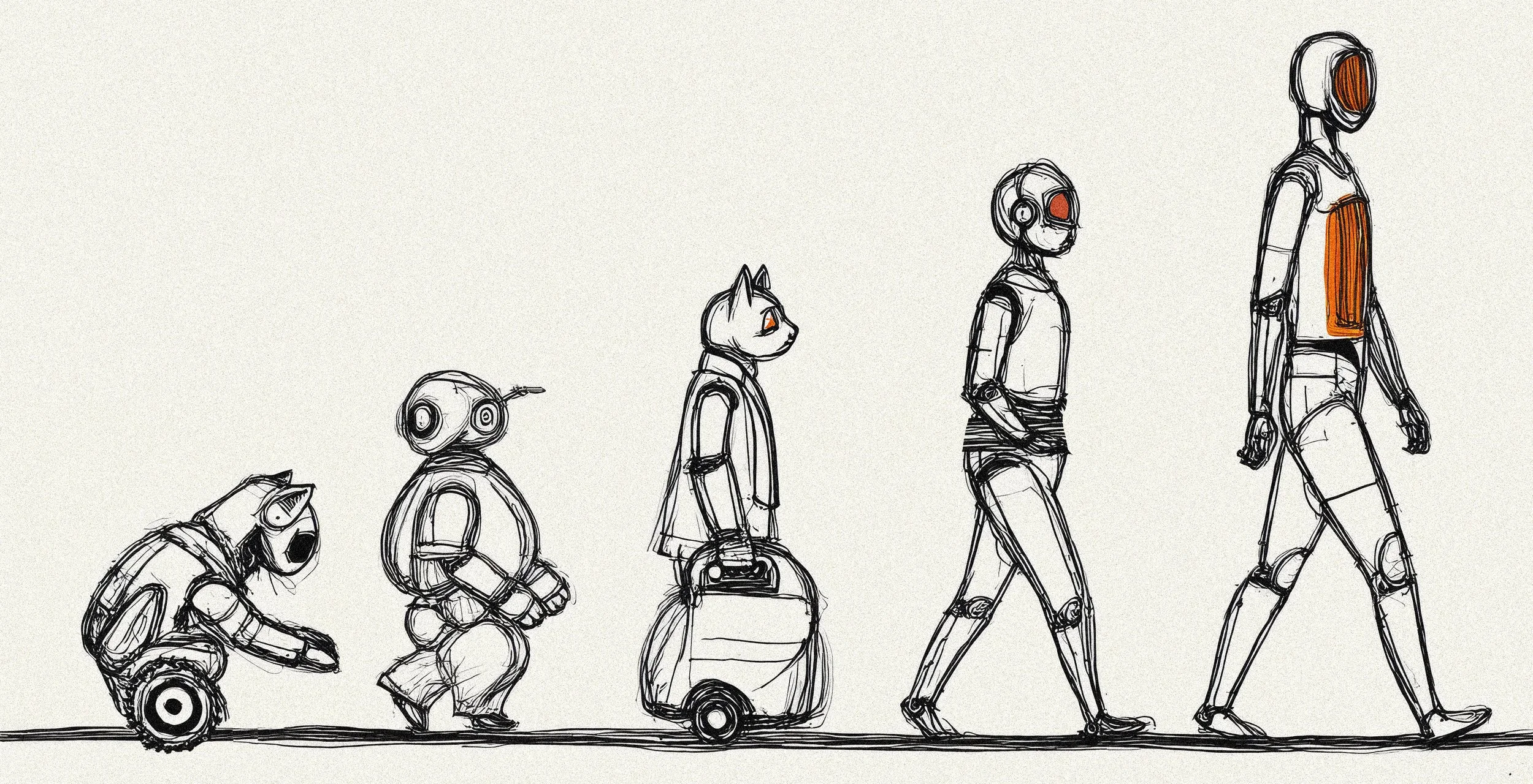
Physical AI sounds abstract. But the reality is much more visceral.
It's a robot. A body shaped like yours. Eyes that track your movement. A voice that responds. Something that walks toward you. Stops when you stop. Tilts its head when you speak. The tech industry uses the term because "humanoid robot" makes people ask questions they're not ready to answer. Who wrote its personality? Who is responsible when it gets something wrong?
Those aren't engineering questions. They're service design questions.
There is a spectrum of robot presence in retail:
01 — Invisible — warehouse robots working through the night. Gone before the doors open. Shopper experience: out of sight and mind.
02 — Ambient Intelligence — Amazon Go. No face, no body, no presence. The shopper as data point being silently processed. Shopper experience: frictionless but feelingless.
03 — Robots with Personality — Café X at SFO Airport, a robotic arm dancing between coffee orders. Shopper experience: performatively cute and shareable.
04 — Humanoid — a body shaped like yours. A face that implies. Walking toward you on the shop floor. Talking to you in real time. Shopper experience: uncharted.
The moment a robot enters shared space, it becomes a spatial brand actor. The form factor is the experience. Which means the form factor is a brand decision. Right now that decision is being made by engineers and procurement teams — people trained to optimise for function, not feeling.
The humanoid robot is not a vending machine with ambition. It is not a shelf-scanner that grew legs. The brief goes much deeper than that. Service design defines who owns each moment, how transitions happen, what failure feels like. It's the difference between a robot that functions and a robot that belongs.
That includes 'social choreography' — where it stands, when it approaches, how it hands you to a human. Social design decisions. Not engineering ones. A humanoid in Bergdorf Goodman should feel nothing like one in Dick's Sporting Goods. Without a brand brief, every humanoid risks feeling the same.
The store needs redesigning too. Circulation, lighting, handoff zones — all built around humans. The humanoid changes every assumption underneath.
Humanoids are beginning to arrive on shop floors. The question is whether anyone briefed them properly before they got there.
The next retail design system is not built around products. It's built around coexistence.
Someone will write the brief. The question is who.
The full essay is here on Substack: https://thecollisionengine.substack.com/p/the-humanoid-on-the-shop-floor
Wired for variance
For anyone who wants the full breakdown https://thecollisionengine.substack.com/p/wired-for-variance
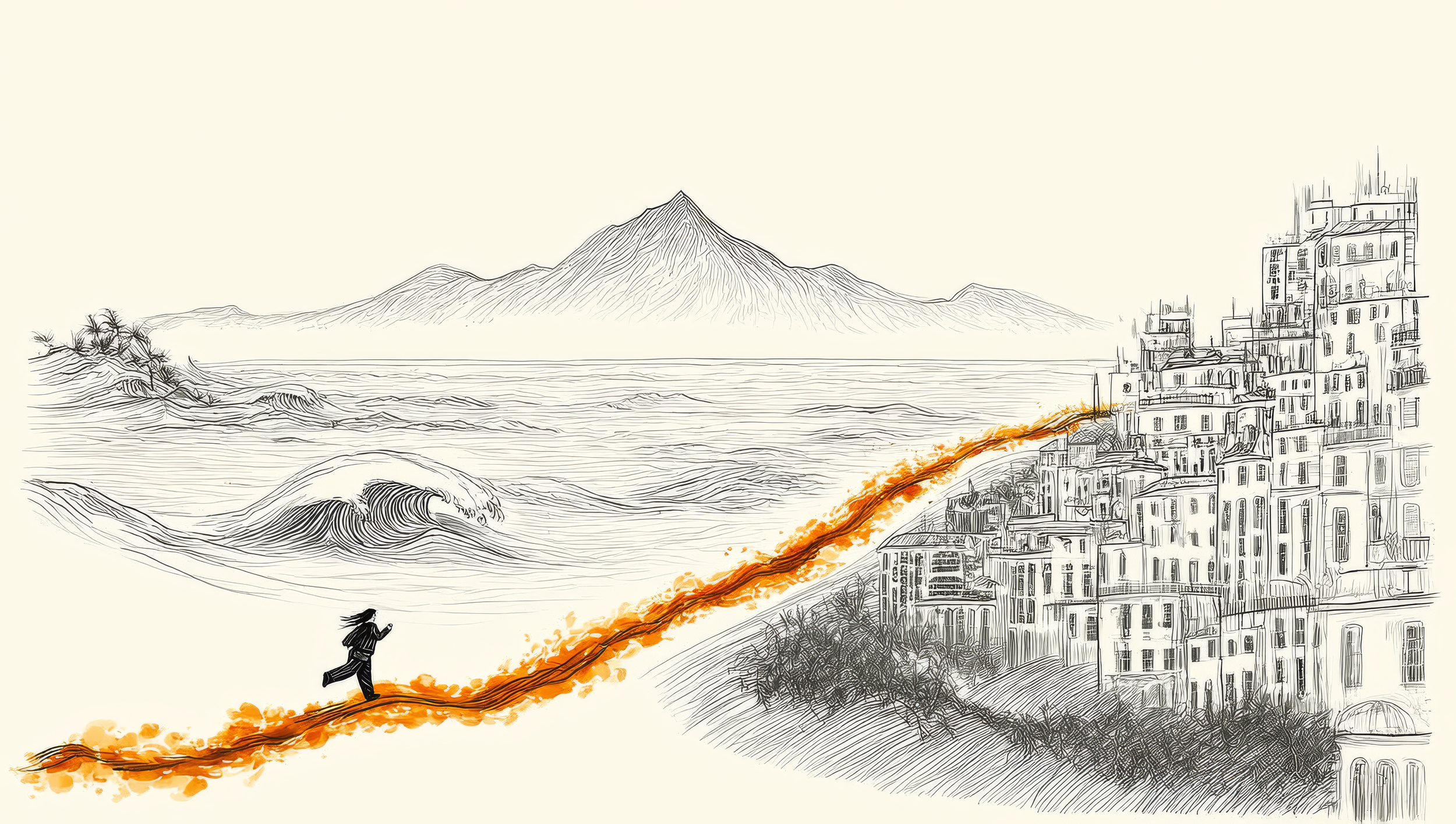
Over 50 house moves in five years sounds like chaos. For me, it's not. It's intentional.
People think I'm running from something.
I'm not.
My wife and I have lived in 50+ places in the last five years. Coast to coast. Mountains. Cities. Ocean. Every 6–8 weeks, we move. Fully nomadic.
But I'm not restless. I'm not avoiding anything.
I'm wired for variance.
Not everyone is. I didn't even realize I was for a long time.
Same desk for six months and the thinking goes flat. Same view, same coffee shop, same weekend rhythm, and the work starts recycling itself. I notice it immediately: ideas narrow, solutions get predictable, the ceiling drops.
It took me 15 years to realize this wasn't a flaw. It was how I'm built.
And once I stopped fighting it, the work got better.
Creative expectations in 2026 are brutal.
AI generates competent work in seconds. Clients expect more for less. Timelines shrink. Critique sharpens. "Good enough" doesn't exist anymore.
The instinct is always the same: Work harder. Refine the process. Upgrade the tools.
But creativity isn't an output problem.
It's an input problem.
Ernest Hemingway said it: To be an interesting writer, you have to live an interesting life.
For me, that means curiosity — about new places, new people, new environments. New city. New inputs. Every 6–8 weeks.
Not chaos.
Just not Groundhog Day.
And that variance changes everything.
New light. New sounds. New rhythms.
The brain can't autopilot. It has to notice.
And yes — a busy, buzzing creative studio absolutely counts as variance. The energy of a great team, the collision of ideas, the texture of live collaboration — that's high-stimulus input. Some of my best thinking happens in that environment. This isn't about rejecting studios or teams. It's about recognizing that input variety — whether it's geographic, social, or environmental — is what keeps the creative engine running.
Lake Tahoe doesn't produce the same ideas as Hollywood. Mountain pace vs city pace. Same brief. Different answer.
Not because the problem changed.
Because the input did.
If your inputs haven't changed in a year, neither has your thinking.
Your version won't look like mine.
You probably won't move every 6–8 weeks. You might not need to.
But you need something that forces variance into your input stream.
Because without it, inputs go stale.
And stale inputs produce stale work—no matter how hard you push.
I'm not saying this because I figured it out.
It took a pandemic lockdown in Brooklyn to realize something simple:
Flexibility and movement weren't luxuries. They were fuel.
That was the pivot.
Away from the comfort of consistency. Toward designing life around what actually makes the work better.
We've been refining it ever since.
And the work got better.
Fresh inputs. Fresh work.
It's that simple.
And that hard.
—
What's your variance?
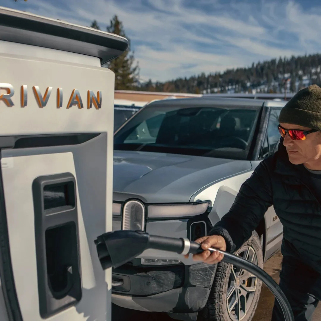
Rivian's road trip
Los Angeles has always loved a spectacle.
Tesla opened a Diner in Hollywood eight months ago. Roller skating servers. 66-foot LED movie screens. Cyberberry gummies — their own branded candy, because of course. Spectacle as strategy. Post this.
Coachella is one too. Most brands arrived with a structure, a logo, a velvet rope and a hashtag — one carefully curated influencer list, one activation that exists primarily to be photographed by people who were invited specifically to photograph it. Gone by Monday. The desert moves on. Tumbleweed Tuesday.
Rivian looked at all of it and did something completely different.
They built a road.
One road. Three pins.
Venice Beach. Joshua Tree. Coachella Valley.
The Rivian Hub in Venice Beach sits in science fiction author Ray Bradbury's former home. No appointment. No guest list. No velvet rope. Belonging before purchase. Community before commerce. In a city that runs on exclusivity — that's a radical act.
The Rivian Charging Outpost at Joshua Tree — 0.9 miles from the Visitor Center — is where the brand idea stops being stated and starts being lived. Complimentary coffee from Joshua Tree Coffee Company. Hammocks. Local artists on the walls. You charge the car and yourself simultaneously. It's not entertainment. It's a service. And service is what builds trust.
At Coachella — Electric Elsewhere, a timber structure on the festival grounds, free to enter. Camp Rivian with AutoCamp outside the gates entirely — Airstream trailers, desert wellness, private transport to the festival. Luxury that gets you outside rather than keeping you in. Together they complete each other's promise in a way neither could alone, which is what a good partnership actually looks like as opposed to what it usually looks like, which is two logos on a banner.
Same brand. Multiple entry points. Multiple audiences. No velvet rope.
On their website, Rivian defines their presence as "a collection of permanent and temporary spaces, and open lands." Three categories. Which maps almost exactly onto one road trip. Permanent space. Open land. Temporary space. They built the taxonomy before they built the road.
The service builds trust. The spectacle builds desire. The road trip builds belonging.
Coachella builds awareness. Joshua Tree builds evangelists. In a world where awareness is cheap and belonging is rare — that's the more valuable investment. The maths are slow but they compound.
The most powerful thing Rivian did across these two weekends wasn't at Coachella. It was forty minutes up the road. 0.9 miles from Joshua Tree Visitor Center. And it's been there all along.
Full piece on The Collision Engine https://thecollisionengine.substack.com/p/rivians-road-trip-from-venice-beach
Polish signals fear
In 2025 we got a new word of the year. Not resilience. Not vibe coding. Not rage bait. Slop.
Merriam-Webster chose it deliberately. AI-generated content had flooded every screen, every feed, every brand touchpoint. First graphics. Then motion. Then film. Now it's crossing into physical space. Slop is no longer a screen problem. It's coming for brand spaces.
Something fundamental broke. Not just aesthetics. Trust. We no longer believe what we see.
The creative world is responding in two completely different ways. Both beat slop. Both prove a human was here. But they are pointing in opposite directions.
The First Way — The Craft Revival. The difference between design and craft is simple. With craft you can see the hands that made it.
Bottega Veneta proved it with fifty years of hand-stitched leather. The 2025 Oscars proved it with 35mm film — Anora, The Brutalist, I'm Still Here. Directors choosing celluloid not out of nostalgia but out of conviction. Film grain as a trust signal. Imperfection as proof of presence.
The Second Way — The Hot Mess. You can see the prop guy holding the prop in the shot.
Uncommon Creative Studio launched the OMODA 7 into the UK market with ads built entirely around practical effects. Rain machines. Air cannons. Cat wranglers. And they left the equipment in shot. The lighting rigs. The crew. The mess of making — inside the hero spot. Not behind the scenes. In the ad. Shipped that way. On purpose.
Because in a world where AI can generate a flawless car commercial in seconds, the only proof that something is real is showing you how it was made. The lighting rig isn't a flaw. It's evidence.
Both are responses to the same broken trust. Both say — a person made this.
But here's the strategic question nobody is asking.
The choice between them isn't about budget. It's about truth. Some brands have craft in their DNA. Others are built for speed, spontaneity, participation. Force the wrong one and you've just made expensive slop.
The question isn't which trend to follow. It's which one your brand actually is.
The future of brand isn't shiny. It's matte. And there's a fingerprint on it.
Full piece in The Collision Engine on Substack
https://thecollisionengine.substack.com/p/polish-doesnt-signal-quality-anymore
Dyslexia is my superpower
Read the full piece on The Collision Engine: https://thecollisionengine.substack.com/p/dyslexia-is-my-superpower-ai-just
Dyslexia is my superpower and AI just made it dangerously exciting.
It started with Lego and Meccano. That obsession with taking raw material and turning it into something that didn't exist before. Turning wood, metal and plastic into go-carts, river rafts and sculptural furniture. The desire to create, to build, to make — it's been there as long as I can remember.
So of course I wanted to build digital things too. Websites. Apps. Products. Code was supposed to be just another material — another tool in the hands of a maker.
There was just one problem.
Code looks like algebra to me. Always has. The symbols. The syntax. The rigid logic that only works if every character is exactly right. The first time I saw C++ I was immediately thirteen years old again — back in a British classroom staring at an equation scratched onto a blackboard that made complete sense to everyone around me and absolutely none to me.
I worked hard. I wasn't stupid. But something about the way those systems were structured — linear, sequential, unforgiving of ambiguity — was simply incompatible with how my brain worked.
It took a few years to understand why. The word they eventually gave it was dyslexia. What I understand now is that I'm neurodivergent — my brain is wired differently, not deficiently.
Dyslexia is my superpower.
And that superpower turned out to be the most valuable thing I have.
Because the obsession with building never went away. It just evolved. When code wouldn't bend to my brain I found something that would — design. The realisation that before you build anything worth building you have to design it first. You have to think about what it should feel like before you decide what it should look like. You have to hold the whole idea in your mind spatially, turn it around, see it from every angle, before a single material is cut or a single pixel placed.
That insight — that designing precedes building, that thinking is making — became the foundation of everything. Thirty years as a designer and creative director. A career built entirely on the same compulsion that started with Lego and Meccano in a childhood bedroom.
I never stopped building. I just found better materials.
When I'm given a creative problem I don't solve it from the front. I reverse it. Turn it inside out. Come at it from a tangent. Flip it back to front. My brain moves fast through those permutations — colliding ideas against each other — until something sparks.
That spark is the idea. The one nobody standing at the front door could find.
Thirty years later it's still how I build. Different materials. Same brain.
Now, for the first time, the tools have caught up with how my brain works.
Vibe coding. Claude. Node-based generative platforms like Weavy. None of them demand linear thinking. None of them punish ambiguity. All of them work the way my brain has always worked — spatially, associatively, through collision and connection rather than sequence and syntax.
I'm not using AI despite being dyslexic. I'm using AI because of how my brain works. And for the first time in my life the interface matches the mind.
In 2026 the tools have finally caught up with the way my brain has always worked. And if your brain works differently too — if algebra felt like a foreign language, if code looks like hieroglyphics, if you've always approached problems from the side door — the era of vibe coding and node-based generative AI was built for you.
We just didn't know it yet.
They want your API
Read the full piece here: https://thecollisionengine.substack.com/p/forget-the-selfie-they-want-your
There's a moment at the end of every great brand pop-up, event or live experience where something passes between the brand and the person who just lived it. For twenty years that something was a photograph — proof of presence, shareable currency, the modern souvenir. Then it became a story. Then a reel. Content that said I was here.
But something is shifting. And nobody in brand experience marketing is talking about it yet.
In 2026, the most coveted thing a person can take away from a brand pop-up isn't content. It's your API. Think of it as a brand's data feed — the live pipeline into everything a brand knows, tracks and generates. Its heartbeat made accessible. In a world where anyone can now vibe code an app in an afternoon using AI tools like Claude or Cursor, that data feed isn't just interesting. It's gold. It's the raw material that turns a consumer into a creator. It's the difference between watching a brand and building with one.
Spotify didn't set out to build a loyalty programme. They built an open API. Millions of people responded by building their own apps, visualisers, playlist tools and music habit trackers — not because they were developers, but because they loved the brand enough to want to make something with it. The API became the deepest possible expression of brand affinity. Strava did the same. Their open data feed spawned an entire ecosystem of training tools, route planners and performance dashboards built by athletes who stopped being customers the moment they started building. They became collaborators. Brand participants. Something far more valuable than loyal. Neither brand designed this as brand experience marketing strategy. But both accidentally discovered something profound — when you give people access to your data, they give you their devotion.
Here's why this is happening now. A new generation of vibe coders has arrived. People who can build a fully functioning app in an afternoon using AI tools — no formal coding skills required. The barrier between having an idea and building something real has effectively collapsed. And these people are hungry for raw material to build with. The brands that hand them that raw material at a brand pop-up, event or live experience won't just earn loyalty. They'll earn integration. They'll be built into someone's daily life in a way no campaign has ever achieved.
Now imagine that happening intentionally. You walk through an immersive Whoop activation. The spatial design is considered. The storytelling is layered. Every moment has been designed to make you feel something. At the exit, instead of a tote bag or a branded water bottle, you receive a physical token — a coin, a card, something with weight and craft, because the object itself is part of the experience. You tap it to your phone. It unlocks access to your personal biometric data feed. Your recovery scores. Your strain metrics. Your sleep patterns. You go home and vibe code your own performance dashboard. Your own recovery tracker. Something nobody else has. Something built entirely around how your body actually works. You didn't leave with a photo. You left with access to your own data — and the tools to build something with it.
Personalisation used to mean your name on a Coke bottle. Then it got smarter — Spotify Wrapped, Netflix recommendations, algorithms that knew you better than you knew yourself. But Version 3.0 is different. The brand doesn't personalise for you. It hands you the raw material and you vibe code something entirely your own. This is maker culture meeting brand experience marketing. The shift from the brand building for the consumer to the brand building with them. From audience to collaborator. From loyalty to integration. The physical token is the new souvenir. The API is the new takeaway. And the person who goes home and builds something with access to your brand's data isn't a customer anymore. They're yours. Permanently.
The question every brand experience marketer should be asking in 2026 is simple. What would you give people to build with?
That's not brand loyalty. That's experience maxxing.
Material Intelligence
This season in Milan and Paris, the most powerful runways came alive through stunning materials, beautiful craft, and raw tactility — the hand of the atelier, the soul of the house.
Fendi × Marc Newson (SS26)
What looked like pixels ripped from a render became something slower and stranger: a quilted landscape of bold colour blocks. Digital geometry reimagined as craft — a set that looked virtual but felt deeply present.
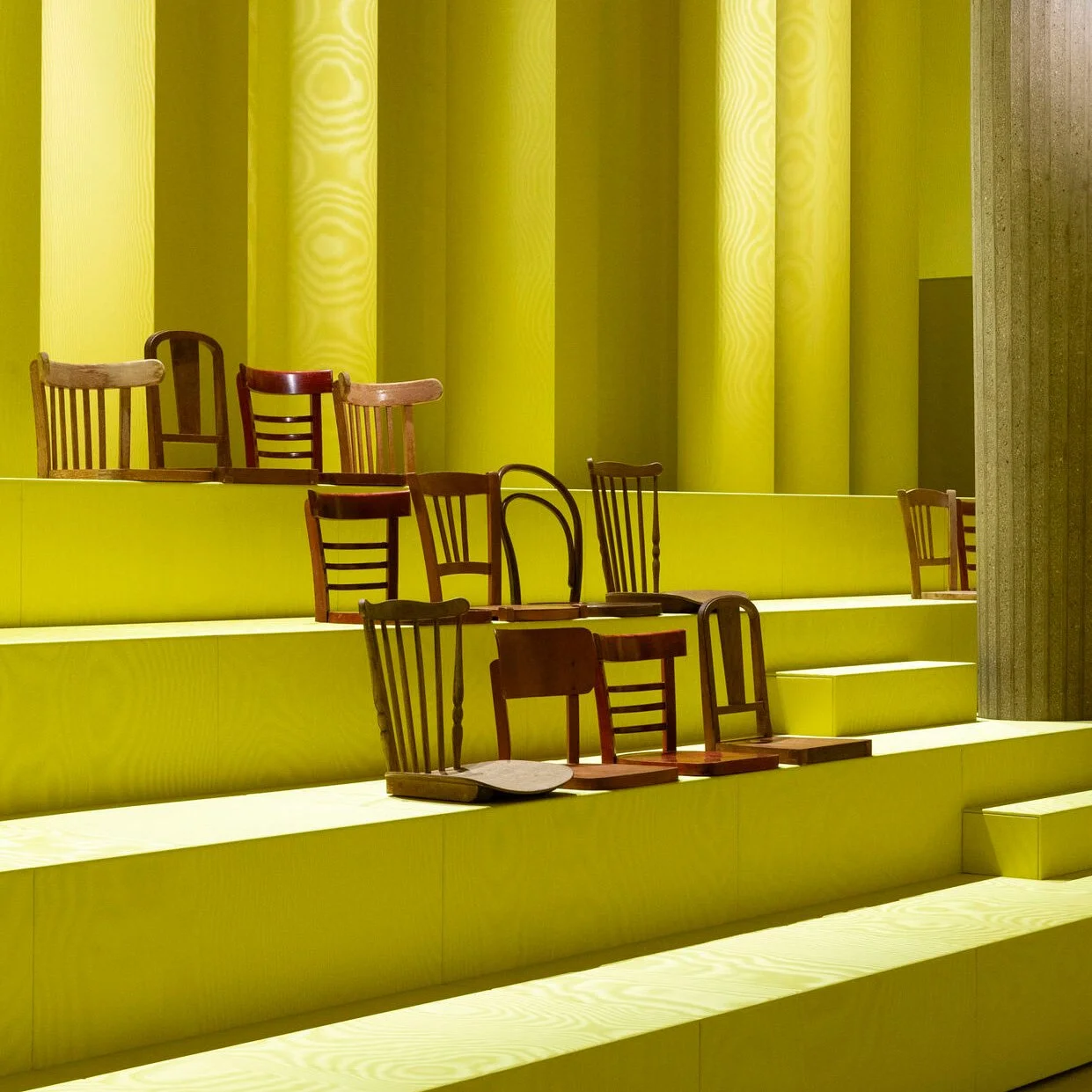
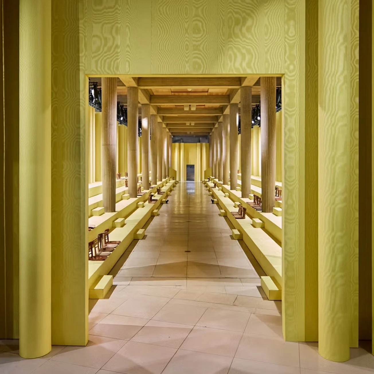
Miu Miu (AW25)
Miuccia Prada foreshadowed the shift with an uncanny dreamscape: a room wrapped in shimmering yellow moiré, lined with rows of sawn-off wooden chairs. Awkward, intimate, defiantly non-digital.
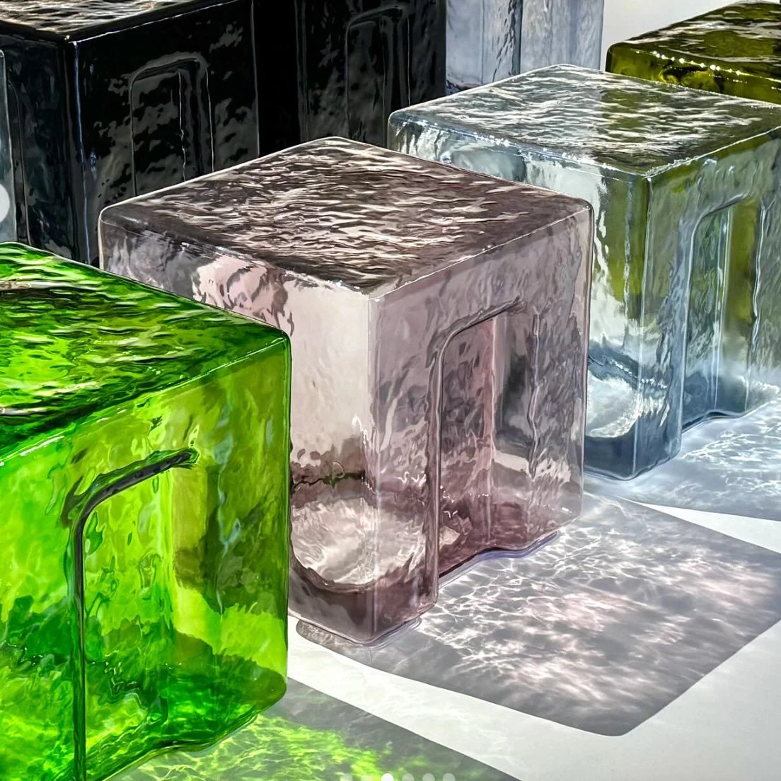
Bottega Veneta (SS26)
Guests perched on hand-blown Murano glass stools — each irregular, luminous, centuries in the making. Not just seats, but sculptures carrying Venice’s heritage into the fashion system. Fragility became part of the theatre.
These weren’t nostalgic gestures.
They weren’t retro throwbacks.
👉 They were radical stances.
Here’s the shift: Material Intelligence is emerging as a cultural and creative counterweight to Artificial Intelligence.
Where AI simulates, scales, and accelerates…
Material Intelligence grounds, slows, and gives presence.
Not opposites, but complements — equal forces designers must orchestrate.
The opportunity for brands? To design with both in concert.
✨ To create experiences where code feels textured, and craft feels amplified.


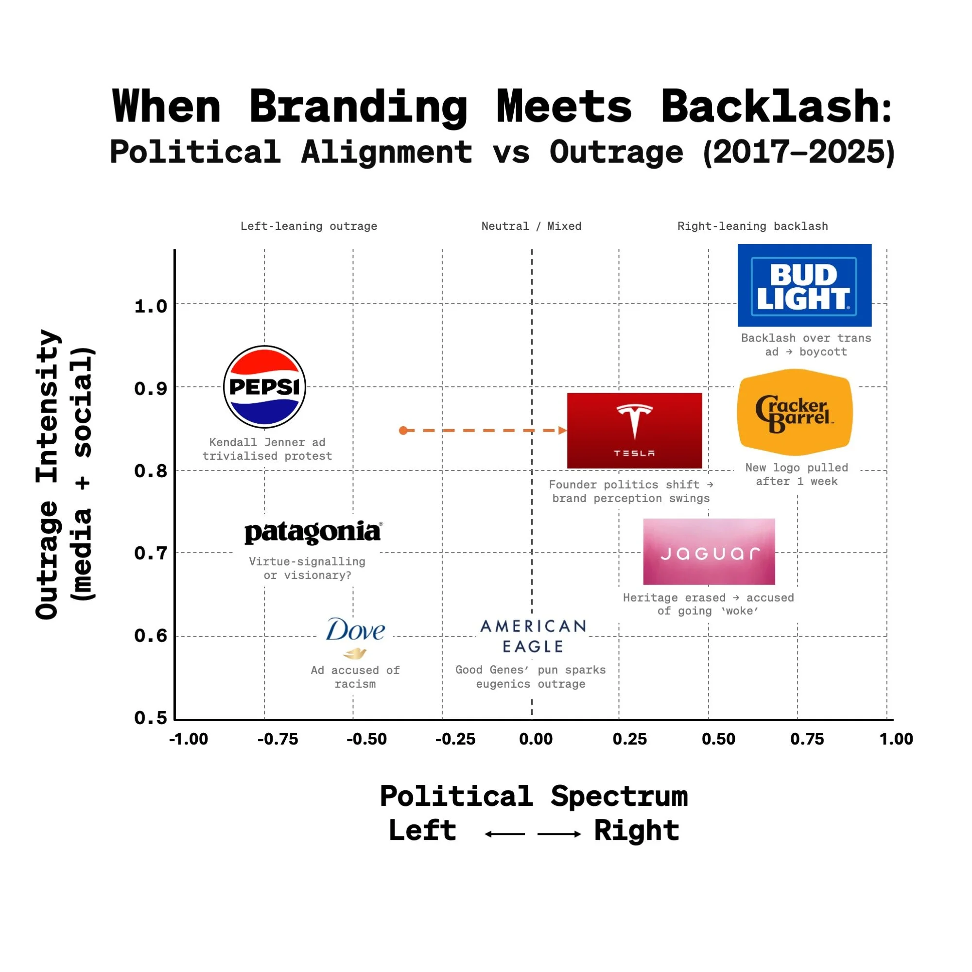
Outrage Wasn’t in the Brief:
Shielding Junior Creatives in a Culture War Era
Cracker Barrel just scrapped its new logo after a week of backlash, returning to its “Old Timer” identity. Before that, American Eagle’s “Good Genes/Jeans” campaign was slammed as tone-deaf. And Jaguar’s rebrand was attacked as “woke” for moving away from heritage cues.
Different industries, different intentions — same result: outrage.
In 2025, it feels almost inevitable that a brand identity, campaign, or repositioning will get caught in the crossfire of the culture wars. But here’s the part we don’t talk about enough:
👉 Behind every logo refresh and campaign line are young designers. They’ve poured months into pixels, palettes, and kerning — only to wake up and see their project trending as “woke,” “racist,” or “tone-deaf.” The internet isn’t critiquing their craft, it’s weaponising it. And yet their portfolios — and their careers — get tied to a culture war they never asked to fight.
So what now? Do we shrug and accept backlash as just another step in the design cycle? Or do leaders step up — shielding their teams, mentoring younger creatives, and reminding them that the outrage isn’t about their craft, but about how brands get dragged into today’s culture wars?
Maybe the real measure of a design culture today isn’t how it weathers public outrage — but how it takes care of the people behind the work when it does.
There’s Nothing Like Launch Day
There’s nothing like launch day.
The adrenaline of the idea.
The pressure of the build.
The quiet thrill when it goes live - and the world finally sees it.
This short film is a love letter to that moment -
when a brand shows up for real,
a product ships,
and what was once an idea becomes presence you can feel.
In the past 18 months, I’ve had the chance to help shape and ship many, including:
📺 Netflix - turning an Upfront event into an emotional experience
🚙 Scout - reviving an American icon for a new generation
👟 New Balance - from a Boston launch party to global rollout
🚗 AFEELA - a new EV brand launched in California
From mobility to media, retail to reinvention -
every drop proved the same truth:
Presence isn’t just showing up.
It’s showing you mean it.
Signal vs. Product A Cracker Barrel lesson

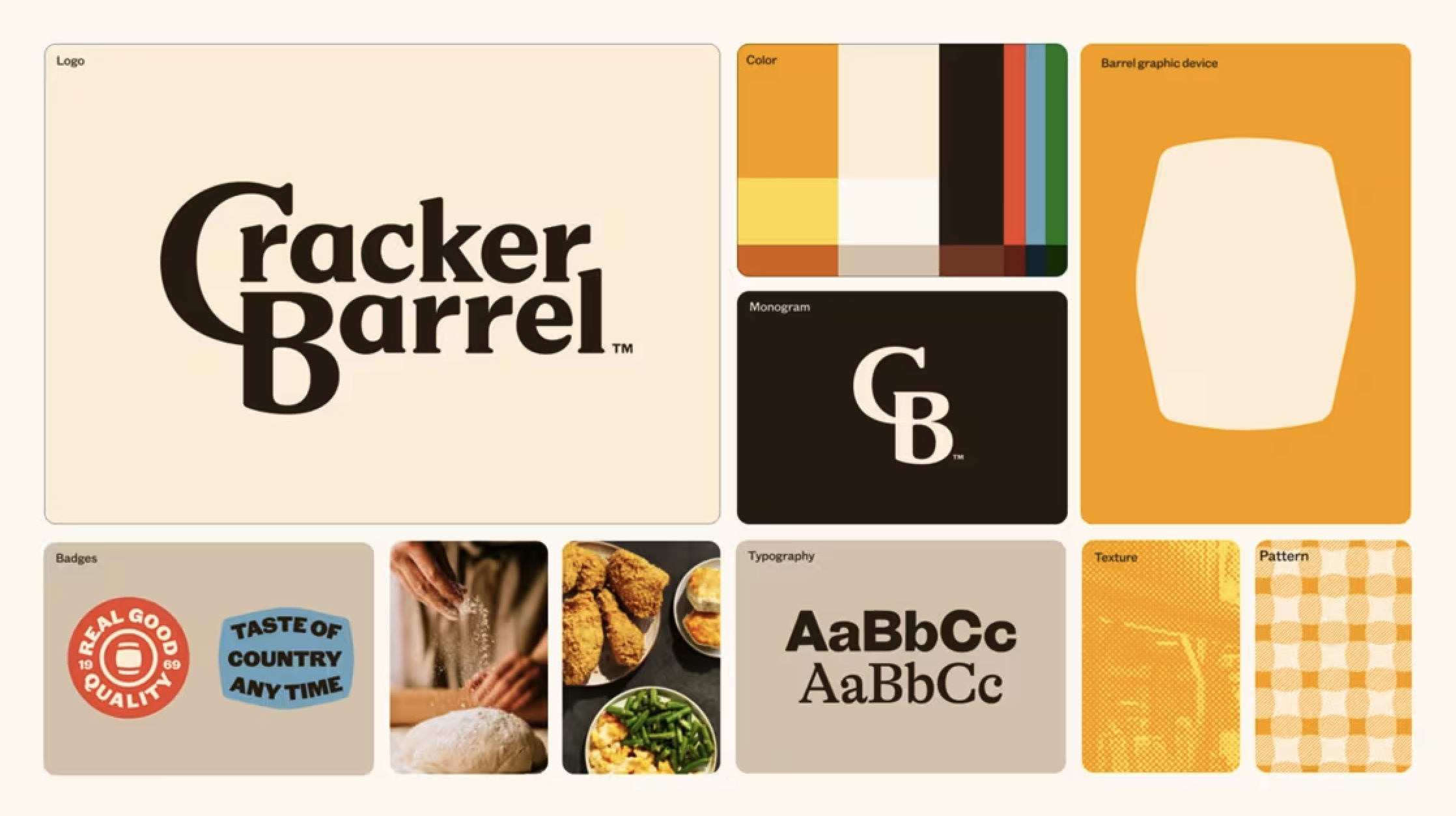
This past week has seen a disproportionate amount of discussion around just the Cracker Barrel logo — and not the bigger transformation underway.
As a designer and Creative Director across visual identity, product, and interior design, I think we’re missing the bigger point: the logo and identity elements are the grammar inside the full brand story. They set the rules, tone, and structure. But the story itself is delivered through the complete brand experience — the food, the interiors, the service, the ambience.
That’s where the tension lies:
The logo is the signal of change.
The experience is the product of change.
Both matter. But they don’t have to evolve at the same pace.
👉 A visual identity can shift more gradually — even in a couple of steps — signaling freshness without alienating loyal customers. Meanwhile, the product experience (menus, interiors, service) can take bolder leaps, explore, and experiment.
Cracker Barrel may have signaled a revolution before customers were ready to experience one. Time will tell if that gap closes or widens.
Takeaway for marketers and designers:
When we design change, we’re not just designing logos, menus, or interiors. We’re designing both signals and products — and the calibration between them is everything.
From Heads-Down To Heads-Up
👁️✨ The next leap in human interaction with brands won’t happen with our opposable thumbs - it will begin with our eyes wide open.
Our posture has always mirrored our technology.
📞 1G - Phones to ears. Listening, not looking.
📡 2G - Phones in pockets. Heads up. Presence intact.
📷 3G - Cameras arrived. Heads dipped. Arms angled.
📲 4G - The scroll era. Thumbs swiping. Eyes glued.
📡 5G - Always on. Arms outstretched. Streaming life instead of feeling it.
🔮 Next Gen?
It’s no longer about looking at devices - but looking through them.
As Google, Snap, Meta, and others push everyday Augmented Reality glasses into the mainstream, we’re shifting again - fast:
• Google Android XR (2025) - Powered by Gemini, in collaboration with Gentle Monster, Samsung, and Warby Parker.
• Snap Specs (2026) - Lightweight, social, designed for daily wear.
• Meta Orion (2027) - High-fidelity AR backed by Ray-Ban, Oakley, and EssilorLuxottica.
Heads up. Both hands free. Eyes unlocked.
👁️ Your gaze becomes the interface.
💃 Your body becomes the controller.
🌍 And the world becomes the canvas - responsive, intelligent, alive.
What does this mean for brand designers?
→ Brand identities that come to life in physical space
→ Packaging that tells its story in AR - origin, craft, sustainability
→ Retail spaces that react to a customer’s attention and mood
→ Wayfinding that guides without distraction
→ Events and activations you step into, not just look at
💡 We’re not just changing how we use tech.
✨ We’re turning movement into meaning - and sight into sensation. 👁️
I used the LEGO store in NYC we designed four years ago as the canvas here - but the same AR magic could apply to any brand space.
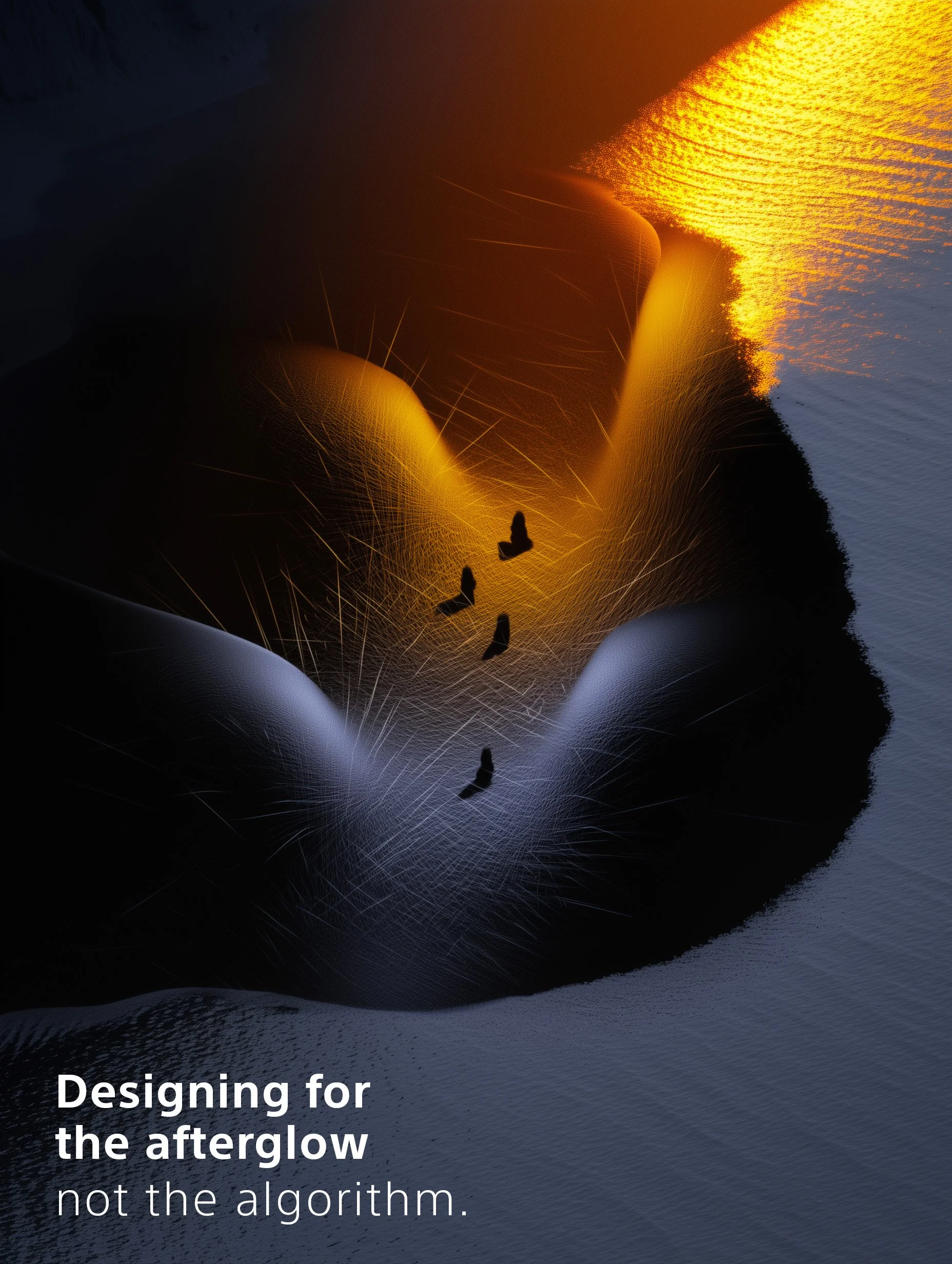
Designing for the afterglow, Not the algorithm ✨
So many of today’s brand experiences are over-optimized for the scroll:
Built to be captured, filtered, and shared.
We design for the story. The scroll bait. The algorithm.
But what if the real impact happens after the post?
When the lights go down.
When the music stops.
When people return to their lives - and still think about you.
That’s afterglow ✨.
And that’s where brand presence lives.
Presence isn’t just about showing up.
It’s about leaving something behind.
Not a hashtag - a feeling.
We’ve all been to branded spaces and activations that looked stunning on social… but faded instantly.
And we’ve all had moments so emotionally resonant, so human, they stuck with us - even without a single photo.
Designing for presence is about making people feel something that lingers.
Not louder. Deeper.
Less “look at this.”
More “remember how that felt.”
Because algorithms change.
But feeling is forever.
The deeper the feeling, the longer the memory - and the stronger the brand.
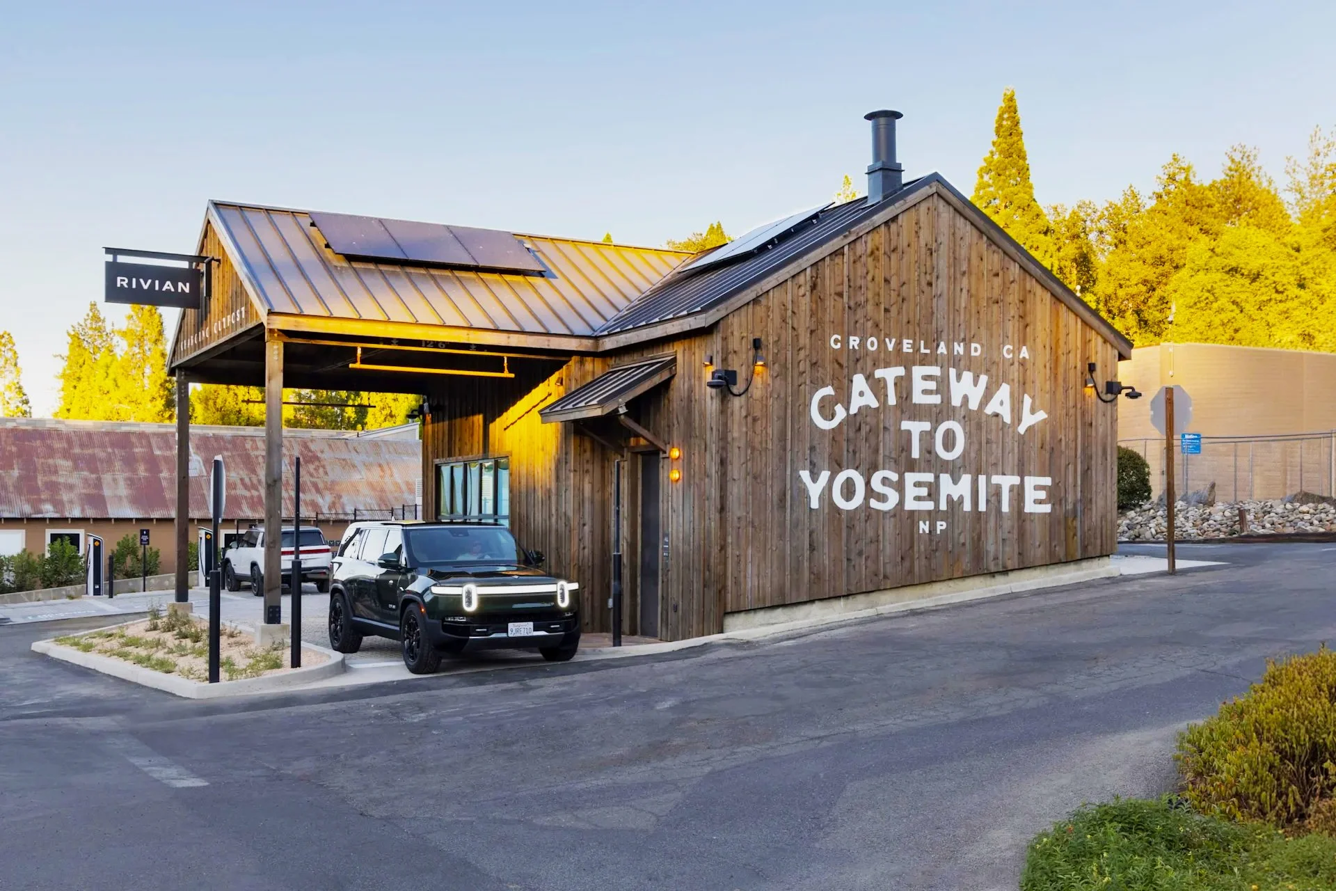
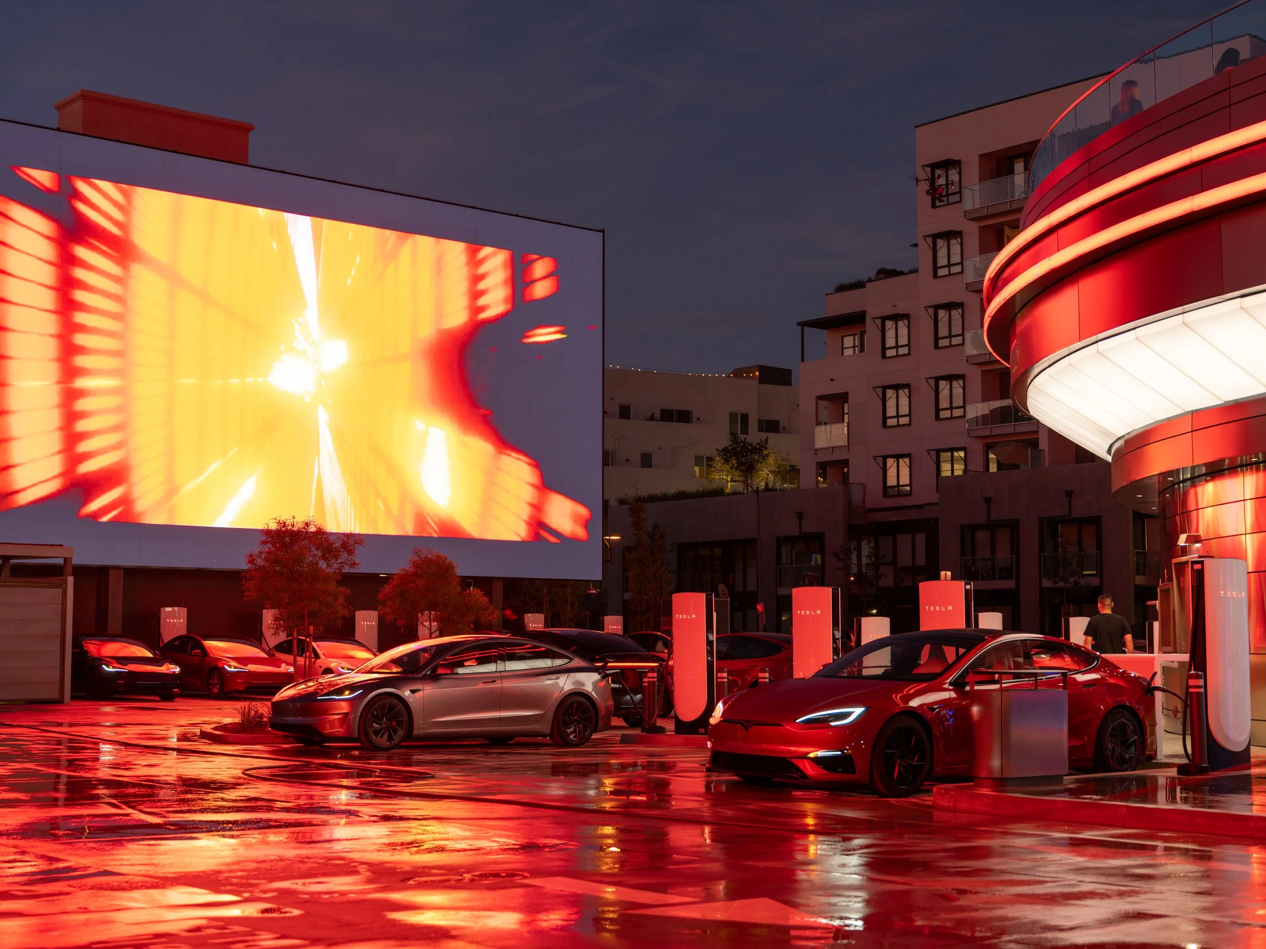
TESLA vs RIVIAN
Two Charging Stations. Two Worlds. One Truth.
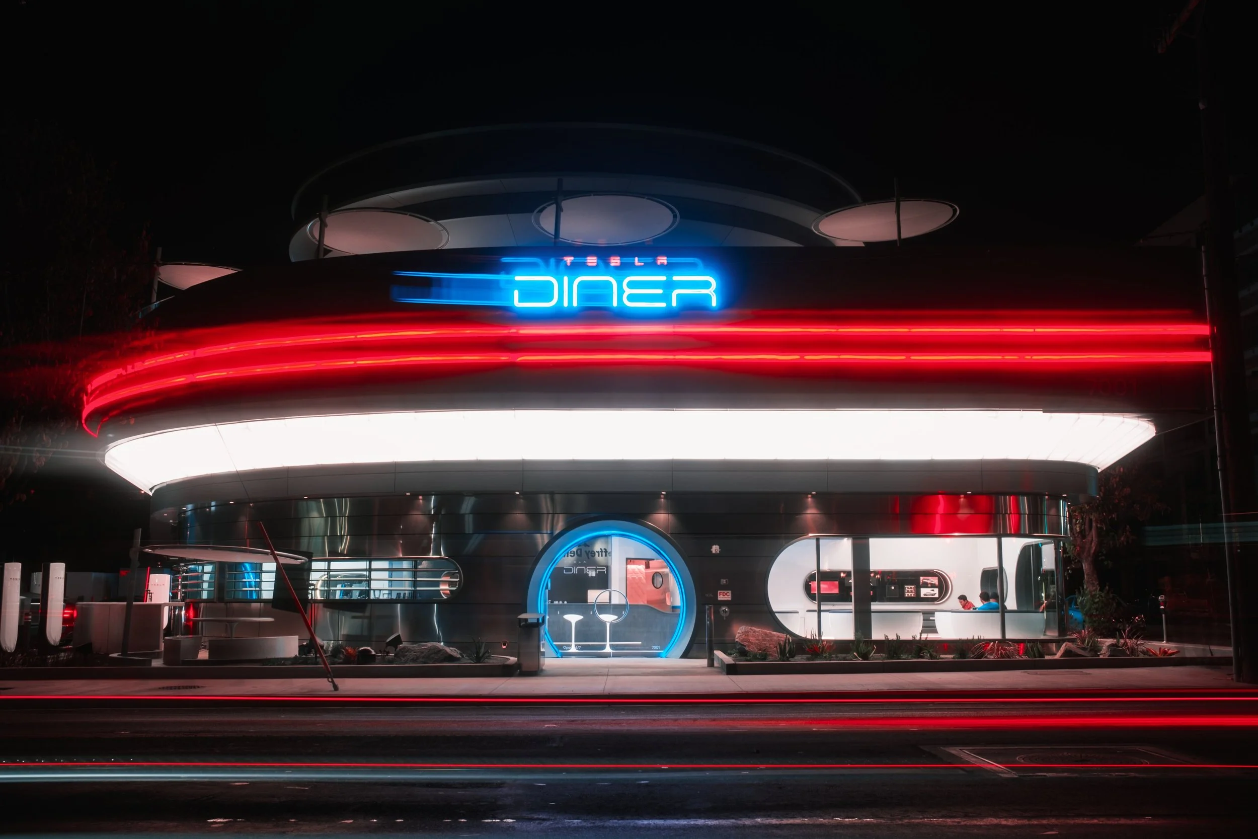
This is a study in brand design.
Not logos. Not taglines.
But design that’s spatial, emotional, and quietly strategic - the kind that leaves a memory behind.
Because EV charging is no longer just utility.
It’s becoming brand theatre.
A new ritual around recharging.
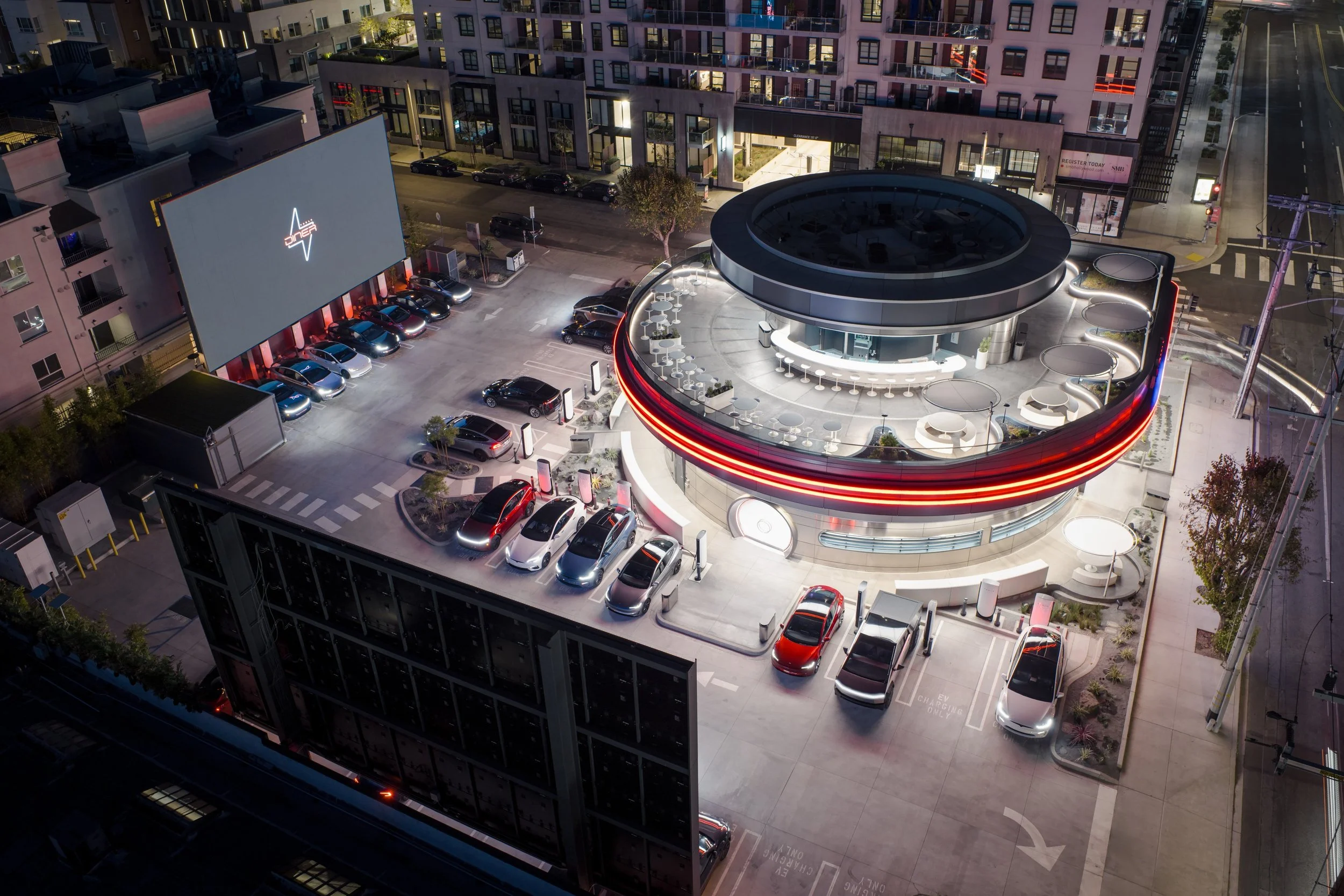
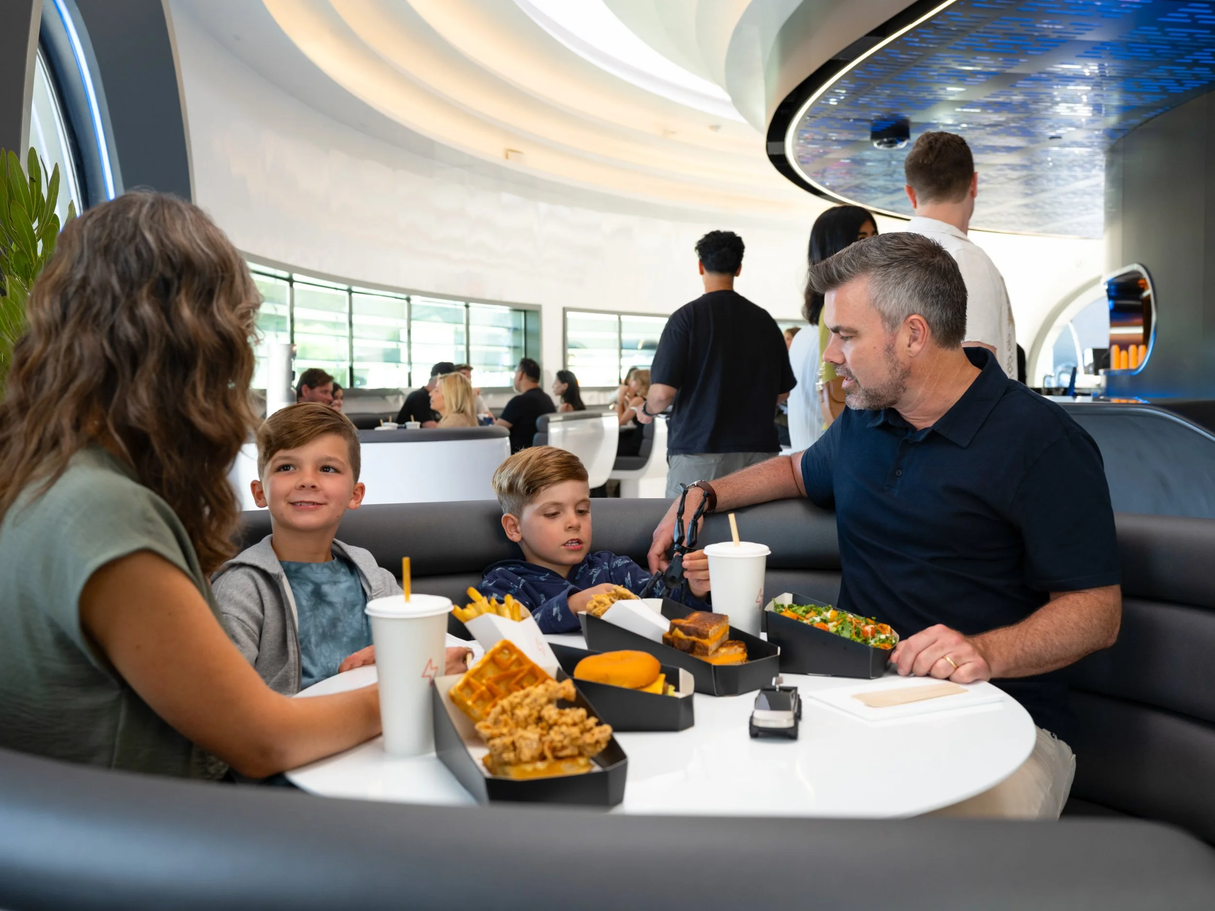
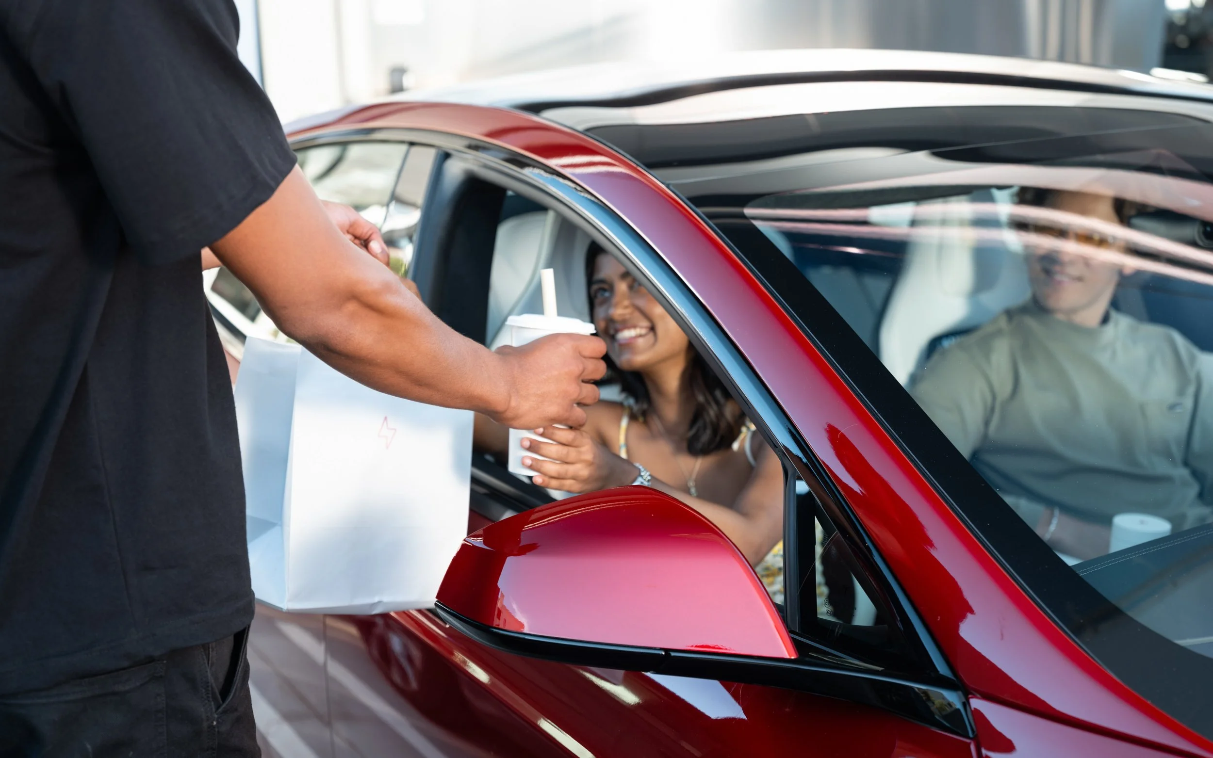
This week, Tesla opened the doors to its most cinematic concept yet:
a retro-futuristic Supercharger, diner, and drive-in experience
on historic Route 66 in West Hollywood, Los Angeles. CA.
⚡ 80 V4 Superchargers (open to all NACS-compatible EVs)
🍔 250+ diner seats, open 24/7
🎥 Two 66-foot LED movie megascreens
🛼 Roller-skating servers
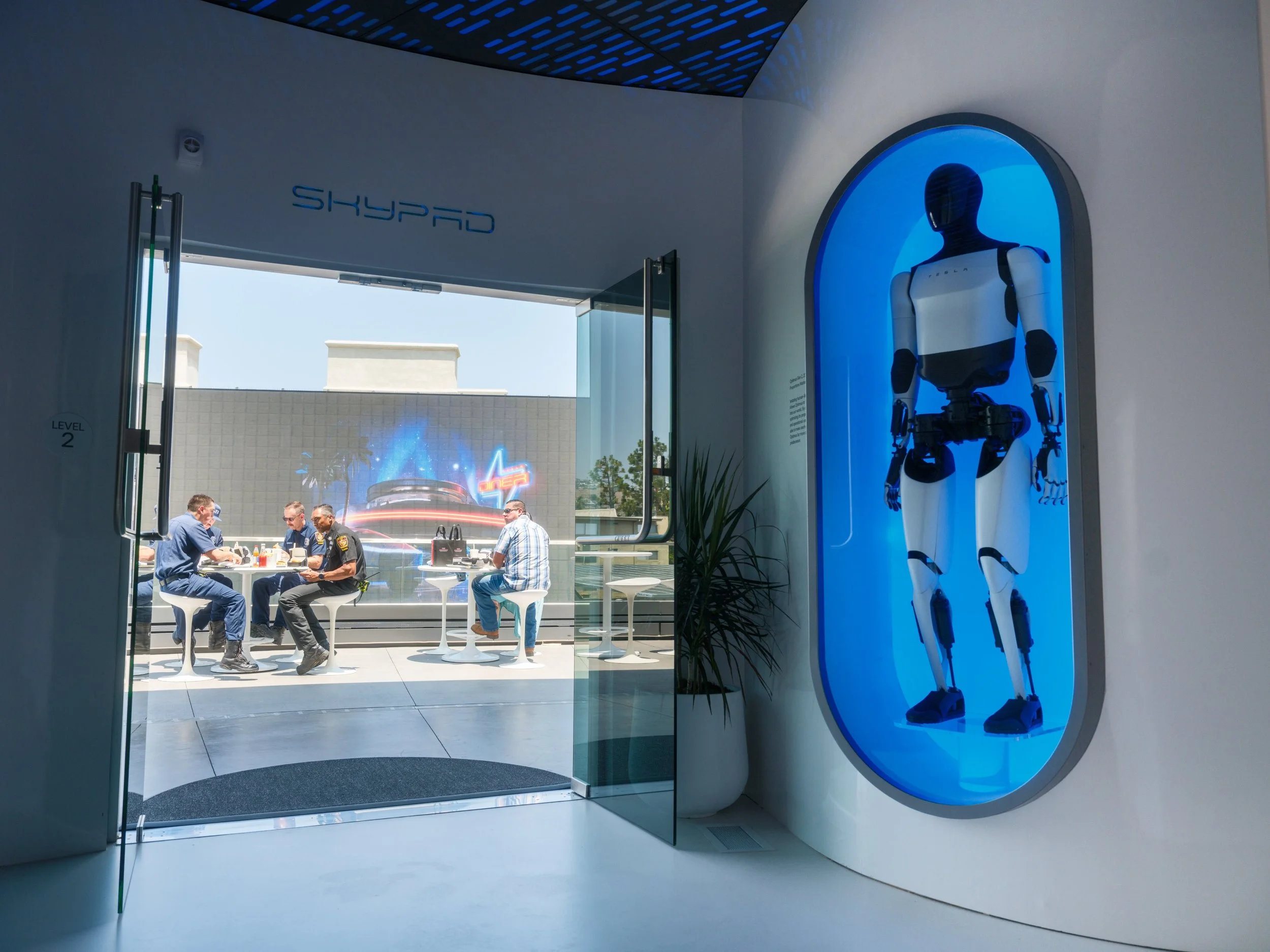
🤖 Tesla Optimus robot displays
🧢 Exclusive merch ('Cyberberry gummies' + diner tees)
All ordered via touchscreen - in your EV.
All delivered to your driver’s window - by design.
The Tesla Diner isn’t just a pit stop.
It’s a sci-fi stage set for the EV future.
Where nostalgia and next-gen tech share fries under solar canopies.
Where charging becomes cinema.
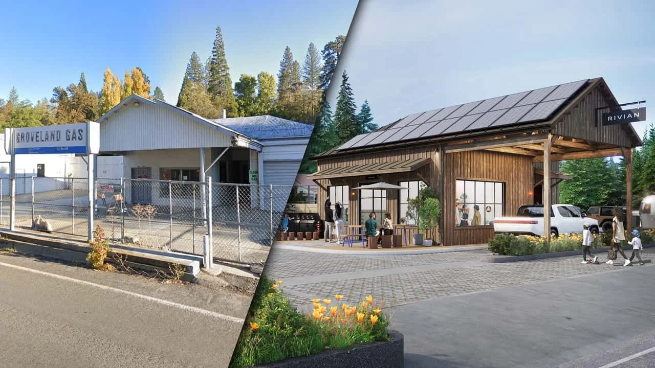
Meanwhile, 350 miles north in Groveland - just outside Yosemite National Park Rivian took a much quieter approach.
The Rivian Yosemite Charging Outpost, opened one year ago,
transformed a defunct gas station into a peaceful waypoint.
🔋 Five fast chargers, quietly integrated
☕ Complimentary local coffee
🌱 Native plants + pollinator gardens
📚 Local library-style shelves
🌬️ Passive cooling via smart ventilation
👨👩👧👦 Educational displays for families
Where Tesla delivers spectacle, Rivian offers sanctuary.
One says, “Post this.”
The other says “Feel this.”
Forget the politics around Elon for a moment.
This is a masterclass in brand presence.
Both brands are proving that charging stations can be brand strategies.
They’re turning dwell time into meaningful brand time.
They’re designing emotion into infrastructure.
They’re making space matter - again.
Because the real innovation isn’t the EV.
It’s how brands design the lived experience of ownership -
the recharges, the rituals, the road in between.
And increasingly, that matters more than the moment of purchase.
(The car lot is dead. The journey is alive.)
When these in-between moments are designed with intention,
brands don’t just earn loyalty.
They create belonging.
One Fox. One Prompt.
Since Midjourney launched in 2022, I've been running a simple yet powerful pangram prompt regularly: "The quick brown fox jumps over the lazy dog." 🦊 🐶
This sentence, utilizing every letter of the alphabet, serves as a fascinating gauge of generative AI's growth in listening, imagining, and visualizing stories over time.
Here's a glimpse of how this prompt evolved annually:
2022 - Glitched Sketch
2023 - Storybook Dream
2024 - Cinematic Vivid
2025 - Emotive & Living Motion
Witness the transformation: from a static pose to dynamic actions like running, breathing, and jumping in the latest clip produced by Midjourney's cutting-edge AI video model, V1. It's remarkable to see the evolution of the same sentence across three years.
As we look ahead, envision the possibilities for next year - could we immerse ourselves in experiences enhanced with sound, aroma, and touch?
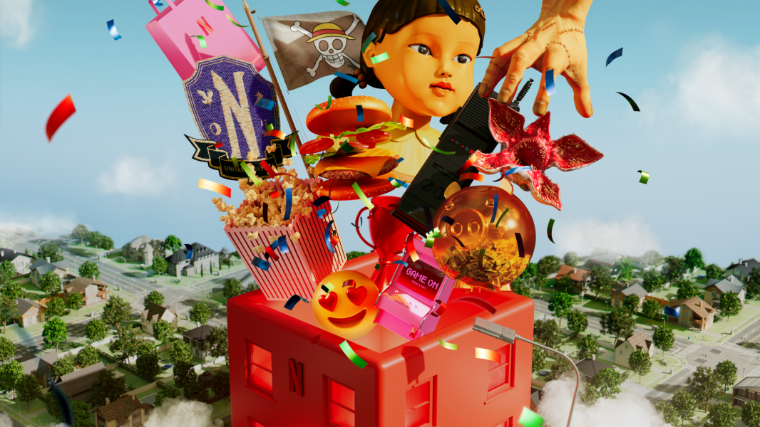
Netflix House: Your Next Story Awaits
Thrilled to see Netflix House officially unveiled!
I had the privilege of being part of the team that crafted the original strategy and concept vision for this idea back in 2023, working closely with the internal Netflix team to imagine what a permanent Netflix experience could be.
It’s incredible to see the final visuals - and I can’t wait for fans to step inside and become the Main Character!

Los Angeles Pink
Could the vivid, almost electric pink of aerial fire-retardant drops - stripped of its harsh chemicals - become the unofficial color of Los Angeles’ recovery from the devastating January fires? 🔥 Imagine Pantone 806 C, that unapologetically bold hue, reimagined not as a warning of destruction, but as a banner of resilience.
It’s the same pink that stains the hillsides after the flames, impossible to ignore, lingering in the mind long after the smoke clears. What if that color became a rallying symbol? A way to carry the city’s spirit forward — fierce, bright, and unafraid to be seen.
Picture it emblazoned across T-shirts, hoodies, hats, and water bottles — worn by Angelenos and supporters everywhere. Each item raising funds for recovery efforts, each splash of pink radiating hope. 💖 A color that tells the story of a city that doesn’t just survive the fire, but rises from it stronger, bolder, and more united than before.
-
![]()
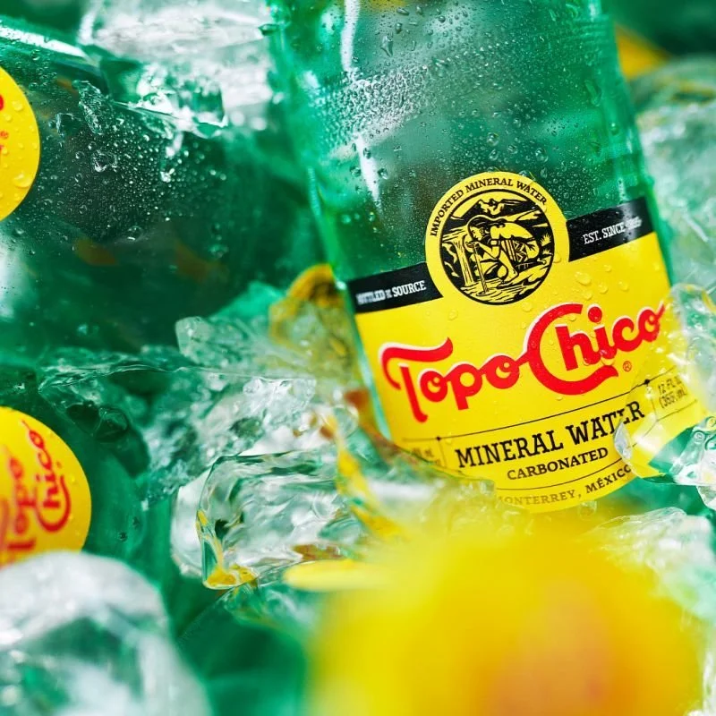
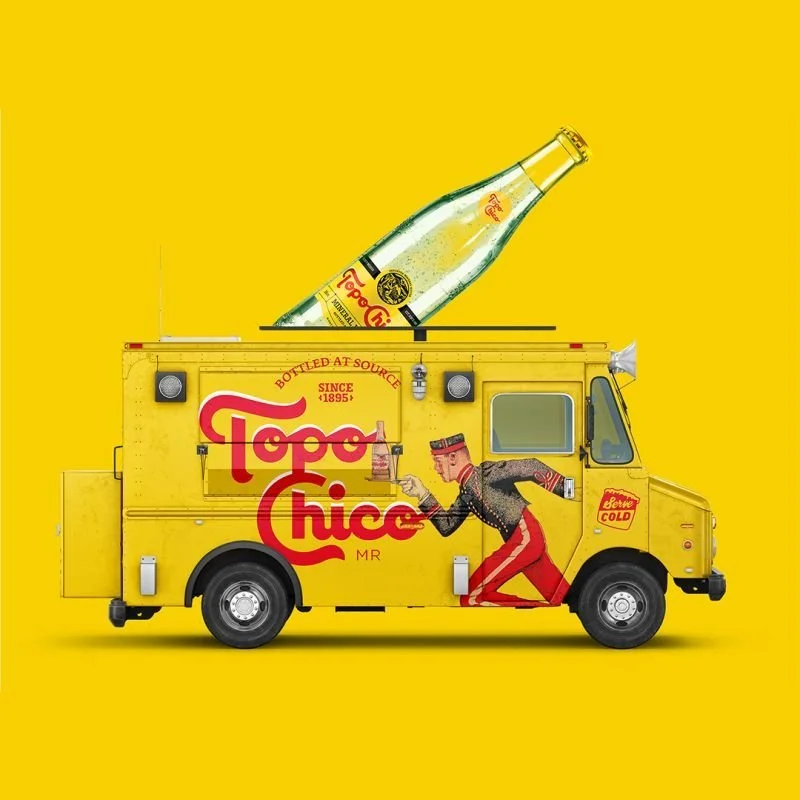
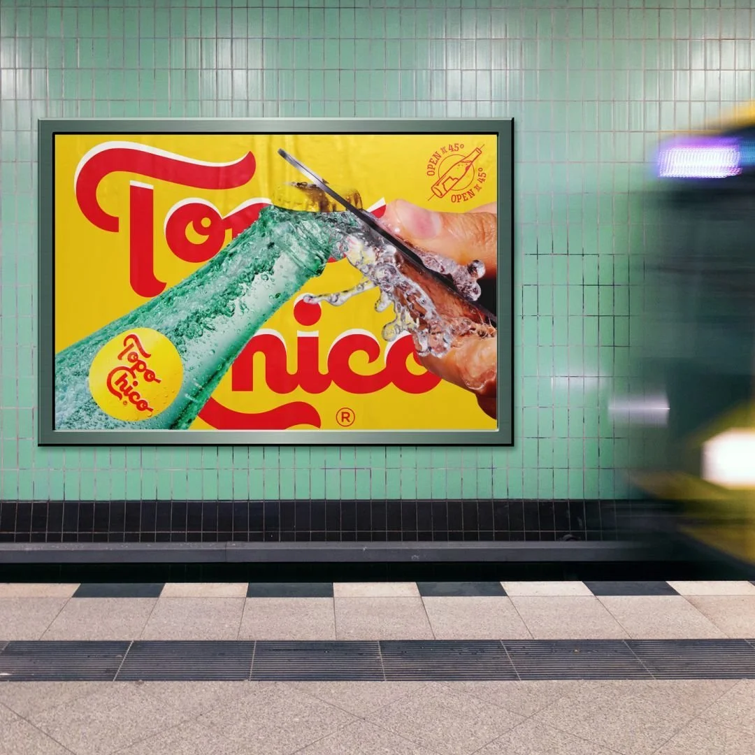
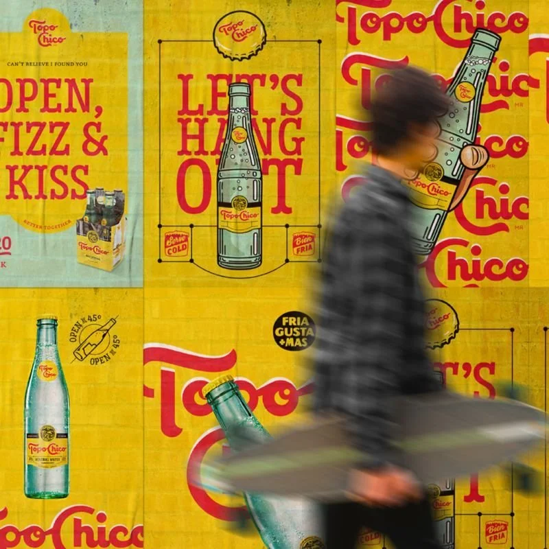
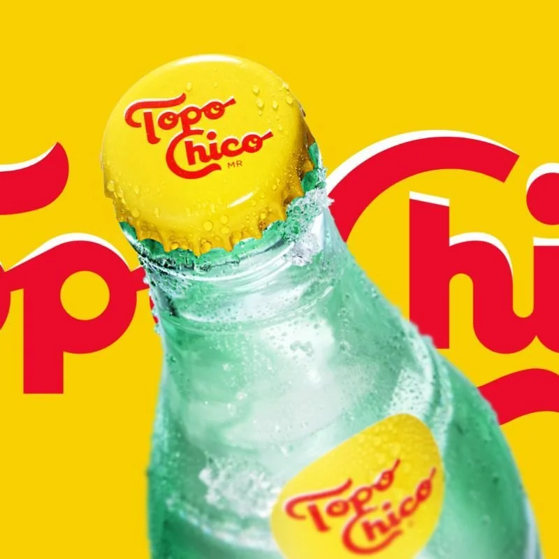
Topo Chico
-
![]()
125 years
-
![]()
A source of discovery
-
![]()
Retaining its roots
-
![]()
Refreshed and versatile identity
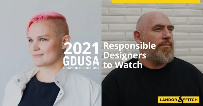
Responsible Designers to Watch
“Good design is a useful to society as good money.” said the late Rodney Fitch. Today I am fortunate to be working at Landor & Fitch which still strives to make a positive difference for our clients, our communities, and the world with extraordinary brand transformation by design.
I am honored to be named as one of the GDUSA Magazine USA’s 'Responsible Designers to Watch' 2021 alongside my colleague and friend MB.
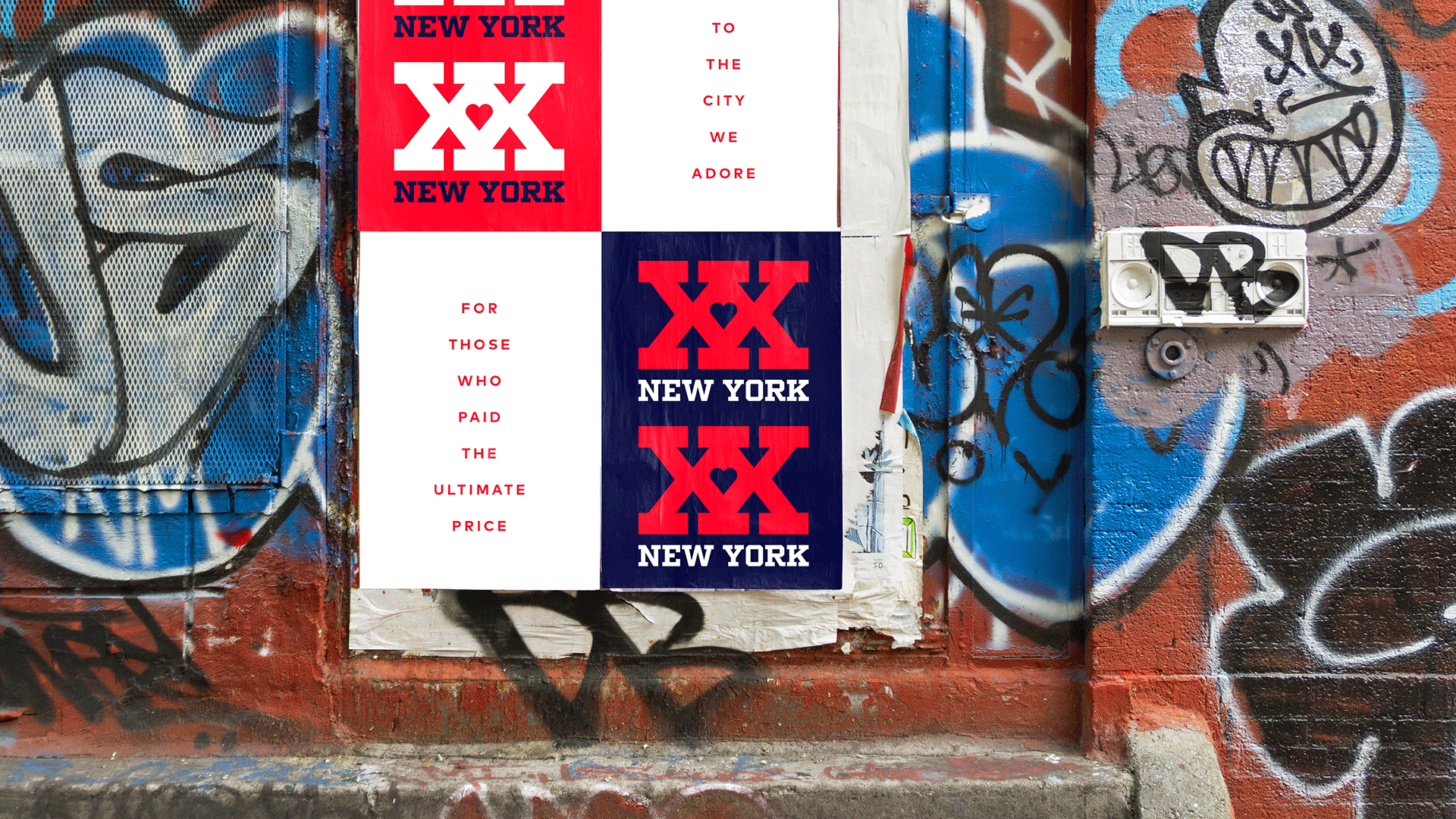
Answer the Call
In honor of the 20th anniversary of 9/11, our Landor & Fitch New York studio designed the XX New York campaign and merchandise to support the New York Police and Fire Widows and Children’s Benefit Fund - also known as Answer the Call.